I started the year the same as I finished the year before, by taking long walks with Gin, my dog. You could say I walked from one year to the next. (Not much else to do anyway, thanks to Covid-19 and the politicians and specialists fumbling with all sorts of rules and speculations.)
Every time I finished a series of works, something that happened several times a year, I got restless because once I finished an idea, it didn't interest me anymore. What I really wanted to do was to start a new painting with a new fresh idea. Only the next work counted.
Color was freedom, at least in my case. Lines, materials and narrative could be too, but for me it was definitely color, above all.
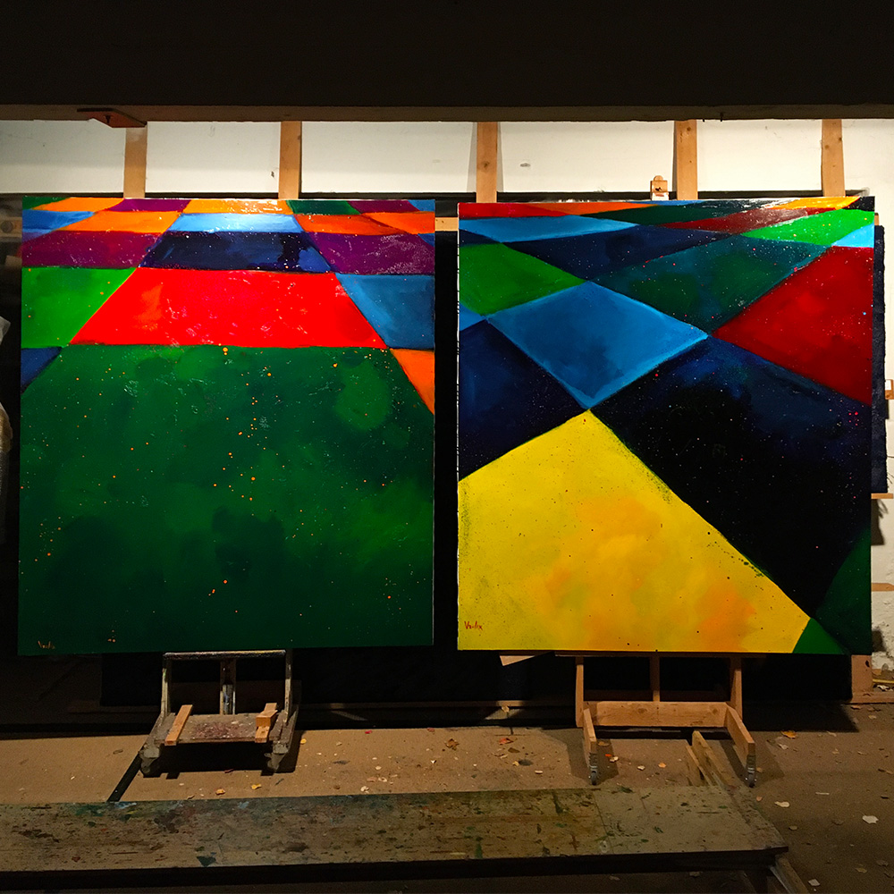
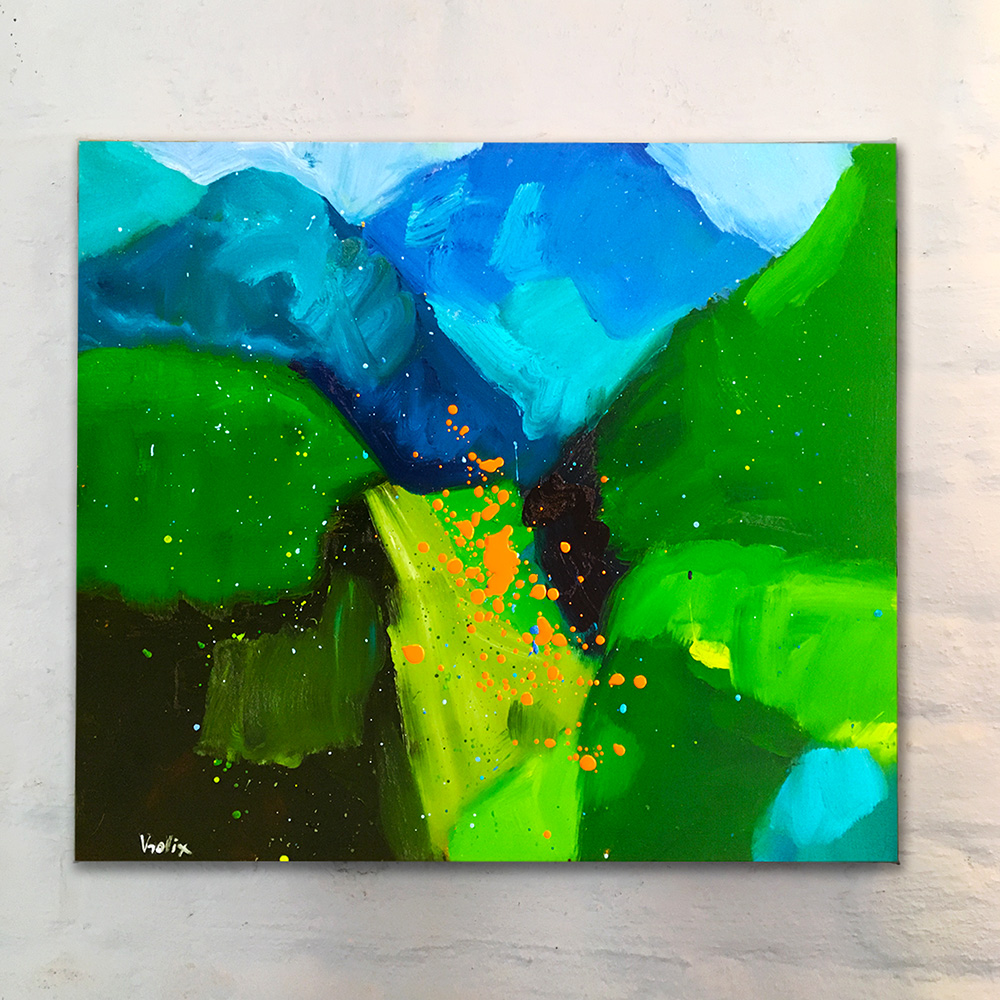
Starting a new painting with color instead of a drawing created its own image. It let me straight to the "Colorfield" paintings, albeit as an abstraction of a landscape. (In a way they looked a lot like an oil paint interpretation of my older fur-paintings.)
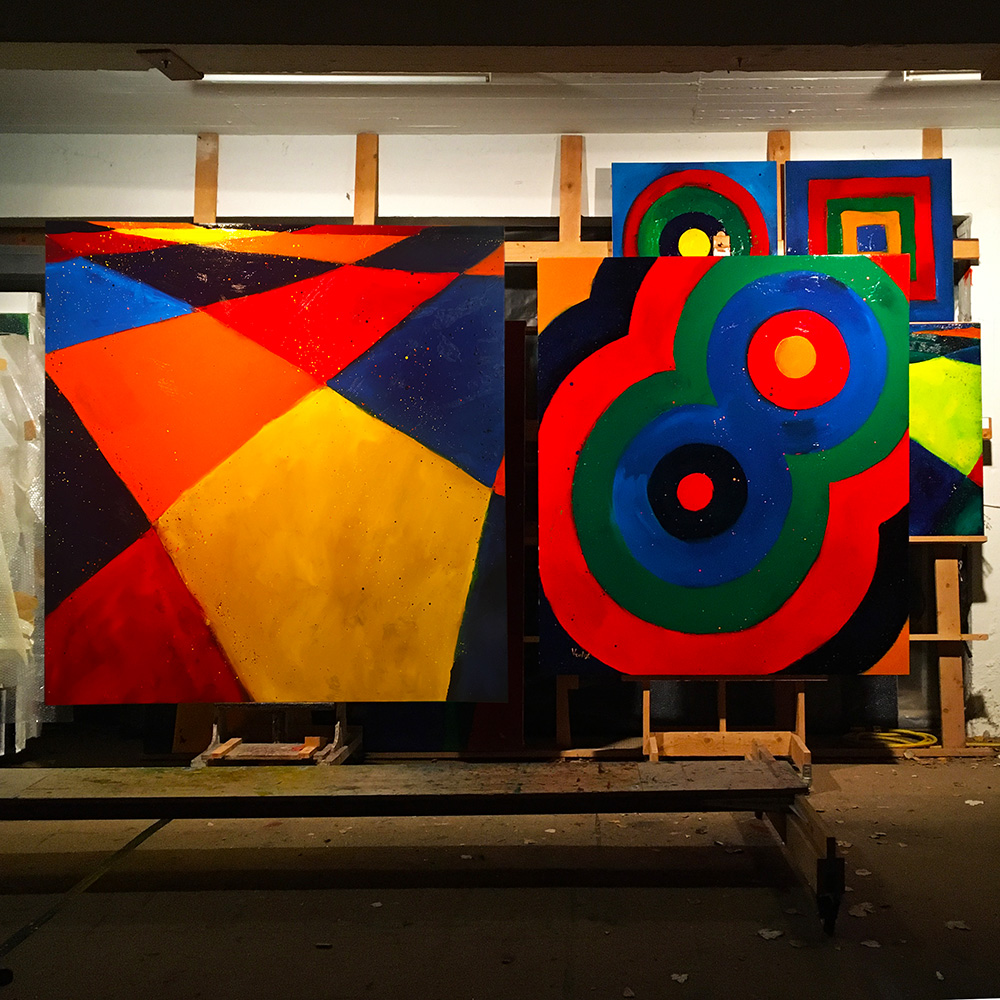
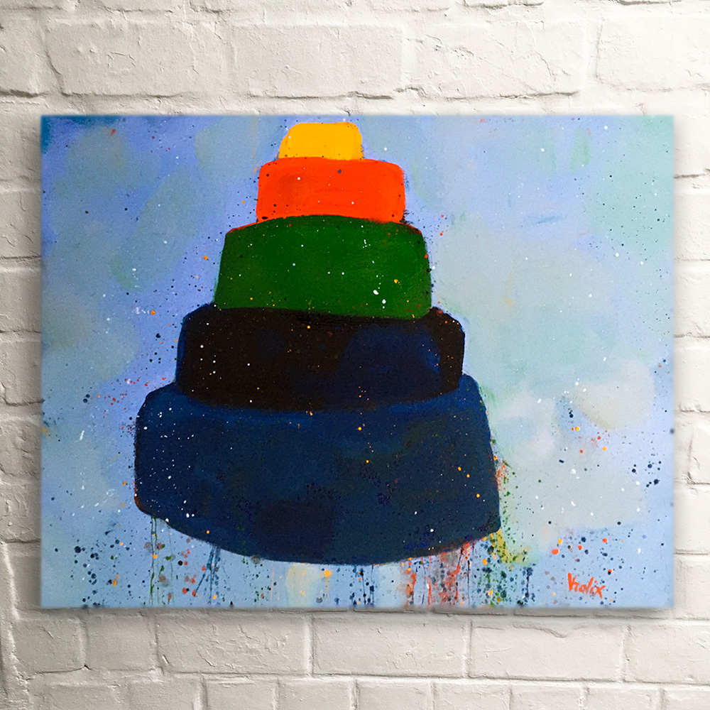
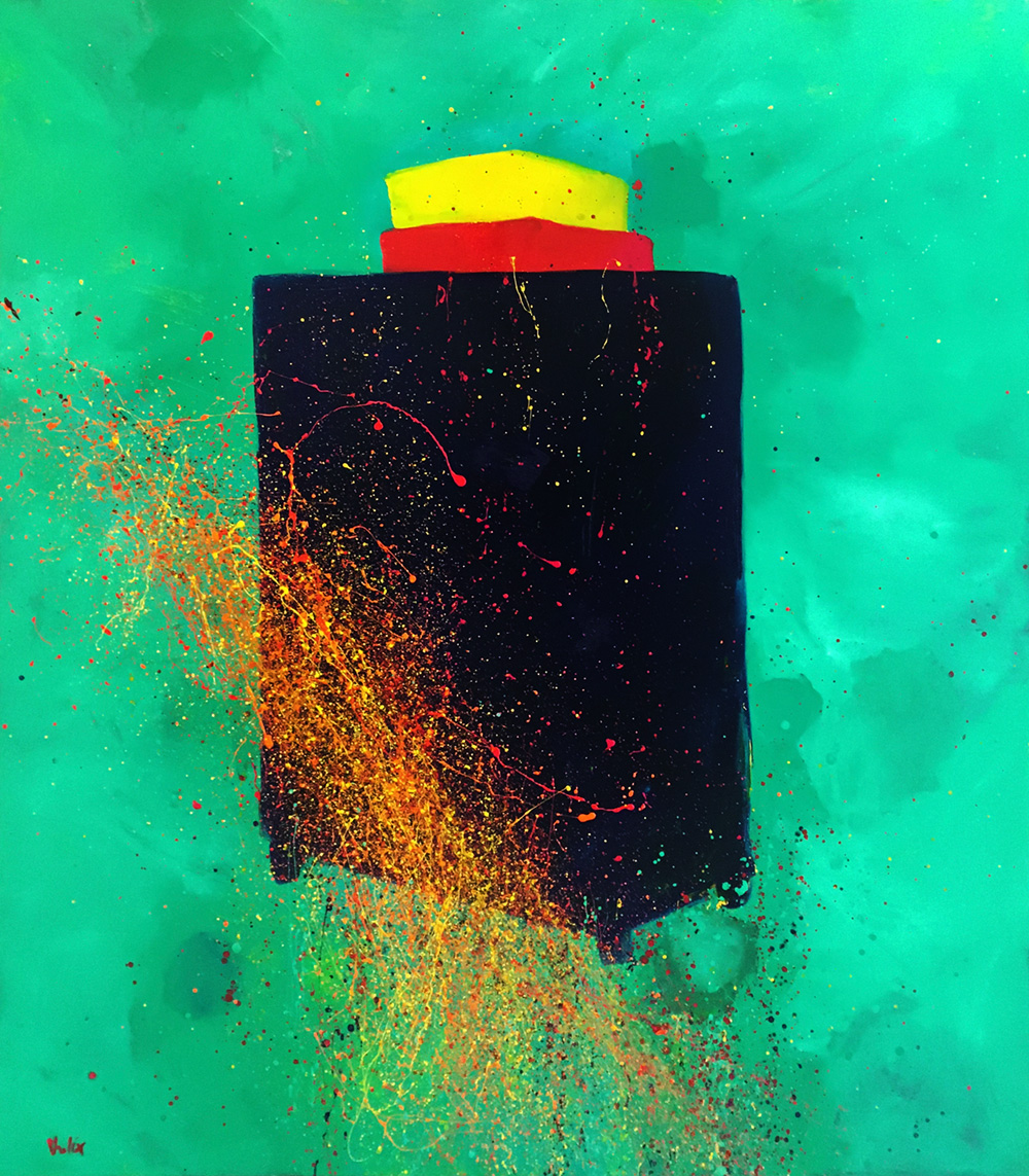
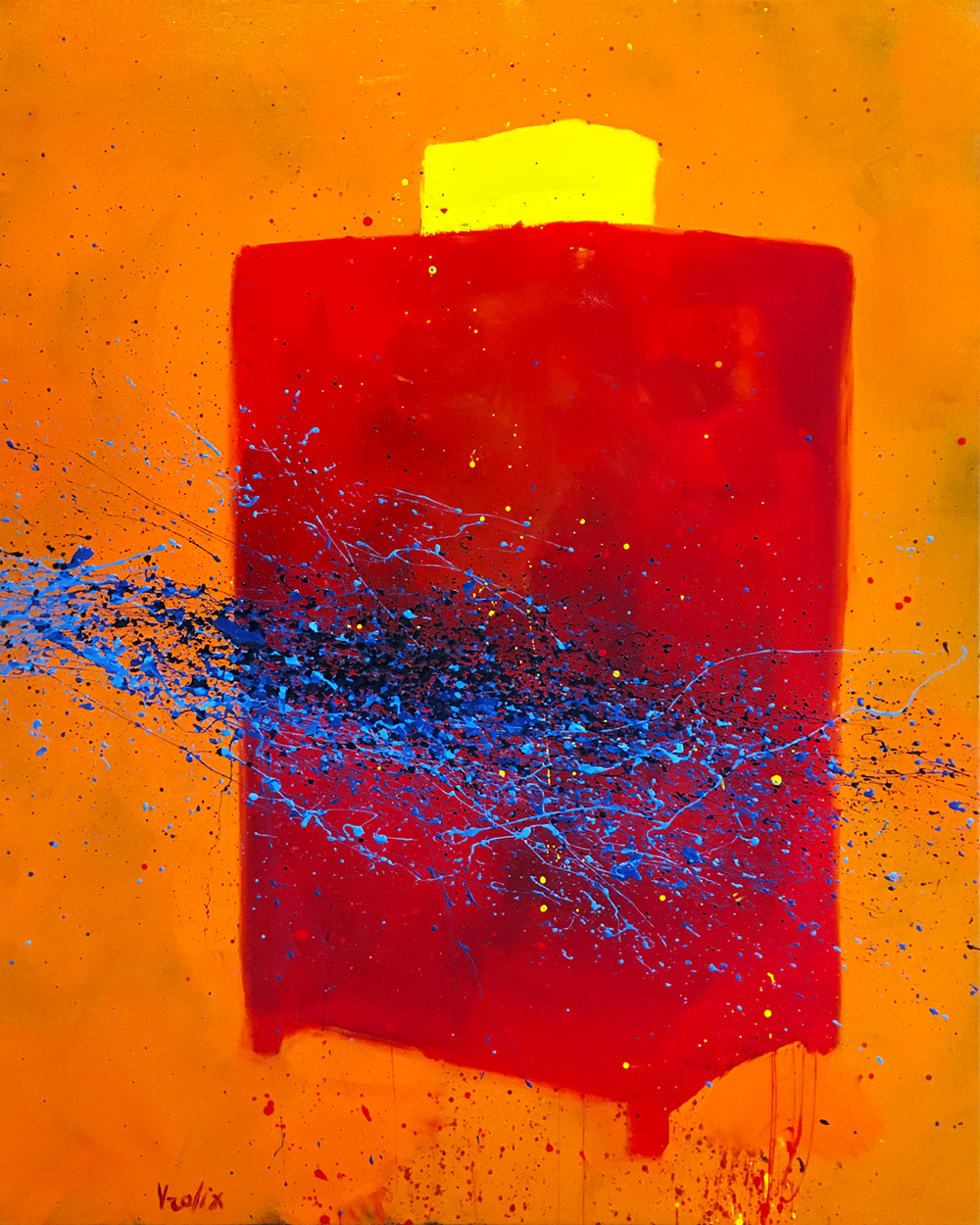
Next I extended this colorfield idea to other subjects like Targets.
"Colorfields 3" (oil & glaze medium on canvas, 190 x 195 cm), "Double Target" (oil & glaze medium on canvas, 175 x 200 cm).
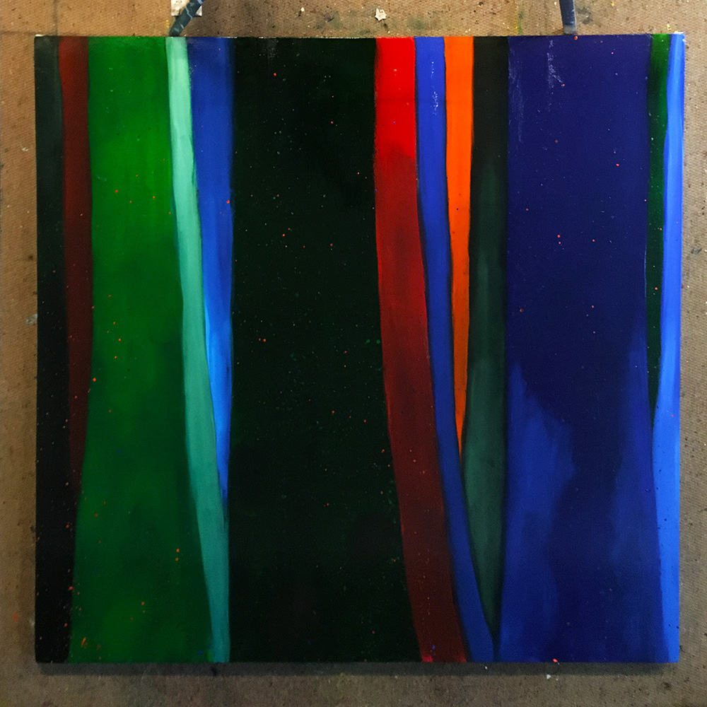
In general all these new paintings became part of a large series of landscapes, fields, forests, walls, interiors and seascapes.
I was fully aware they were not finished yet but one has to start somewhere. They were an importend first step.
"Woods" (oil & glaze medium on canvas, 180 x 180 cm).
HISTORY IN COLOR,
MAKES SENSE
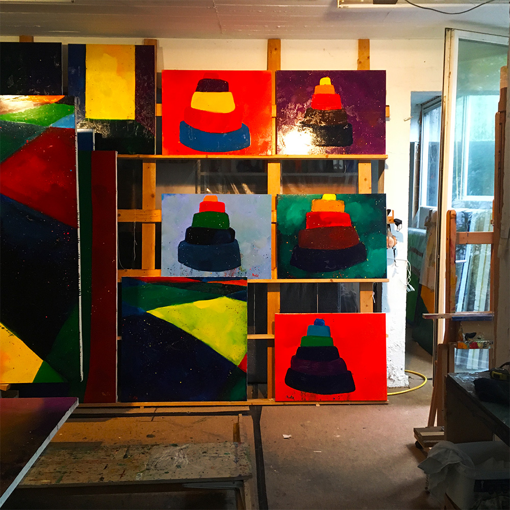
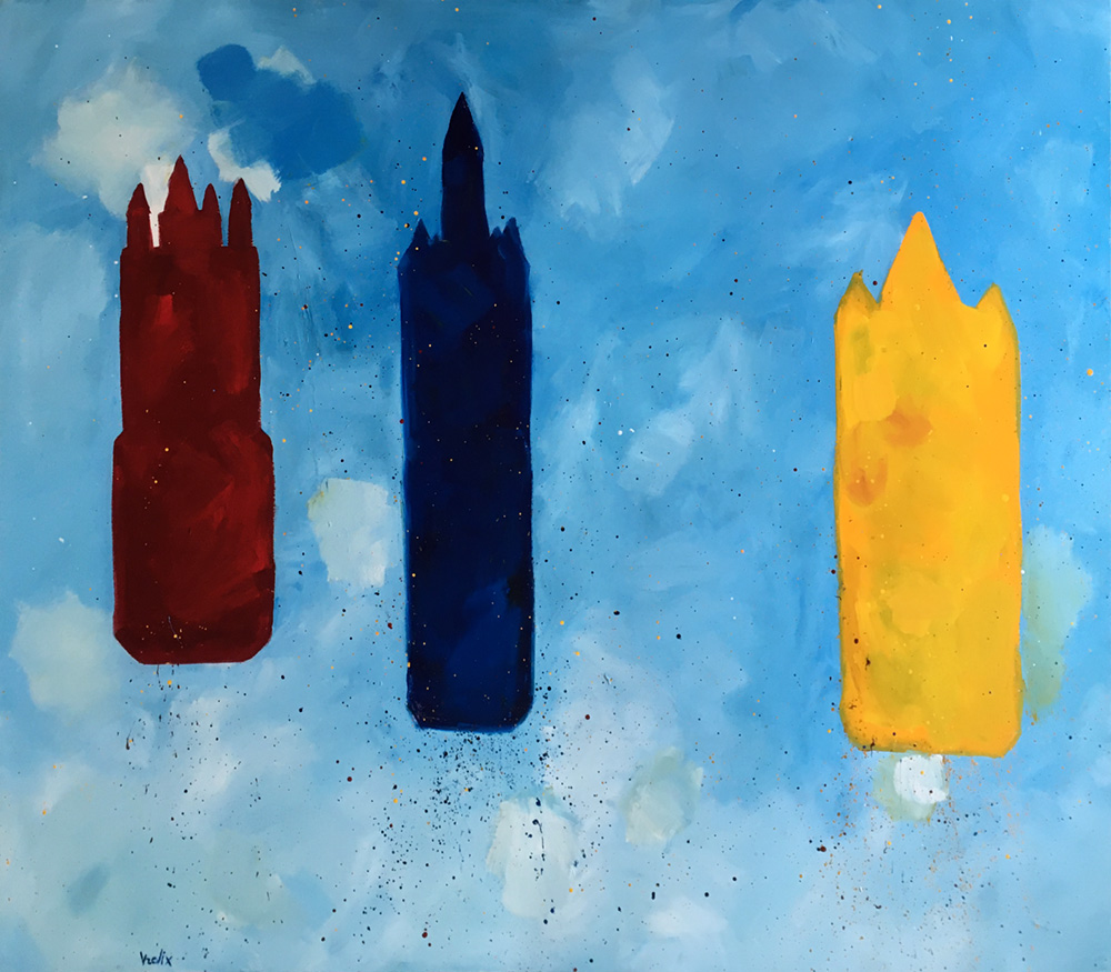
The last of these colorfield paintings, the "Babylon" series, became the most satisfying so far. Of course the "Tower of Babylon" came out of (western) art history but was mostly inspired by, as was so often the case with me, Brueghel. Or to quote Baselitz - Looking backwards to move forward.
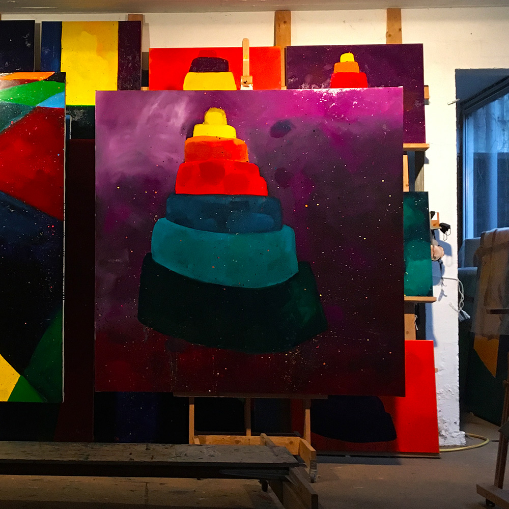
Another reason I liked these series was that color and subject became one.
"Babylon Violet" (oil & glaze medium on canvas, 180 x 180 cm).
The Babylon series were the first paintings I considered "finished" that year. Never the less, all my attention was on the use of color. The subject, no matter how good it was, was more an excuse than anything else.
"Babylon Manganese" (oil & glaze medium on canvas, 70 x 90 cm).
A narrative in painting was always somewhat dubious. That became very clear to me when I did a Babylonian version of the city of Ghent.
A subjects importance was never to stand in the way of the painting. What that meant was, it shouldn't be stupid or dumb, social or political, or just meaningless, in those cases the narrative would become more important than the painting (by irritation) and that was not what it was suppose to be.
One should never see the narrative instead of the painting, the painting was supposed to be the narrative.
PS. Making a (visual) statement like let's say, about other people's misery, was in my eyes just pretentious, a hidden form of feel good disaster-tourism.
A SUBJECT WAS A WAY
TO LET COLORS SING,
NON HARMONIOUSLY.
In art the real story was always in the handling of the paint, hence the term "painting".
In general a viewer was trying to make sense of what he saw by understanding what he thought he saw. An artist on the other hand wants to see the painting not the subject, because that's what it is, a painting.
You want to understand art, see the painting not the image!
"Minotaur IV" (oil & glaze medium on canvas, 190 x 190 cm).
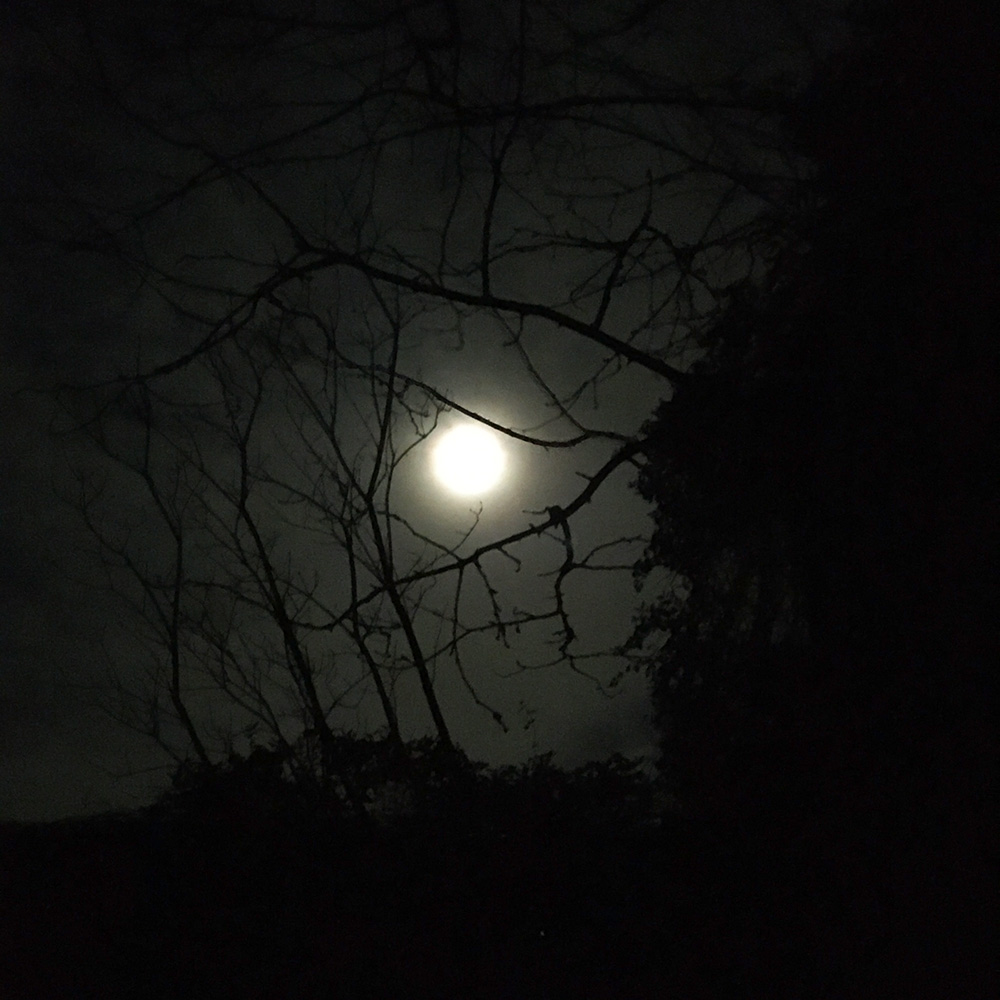
Full moon outside my studio window!
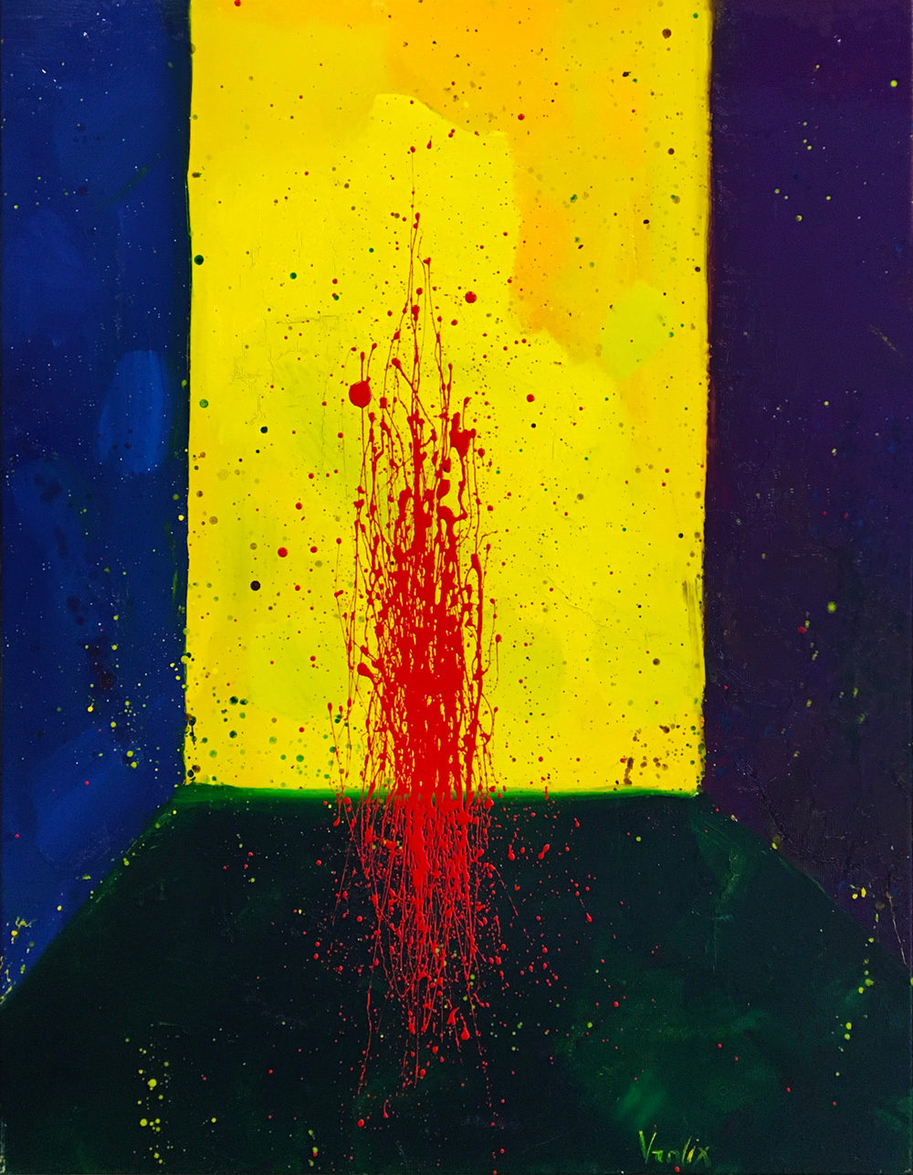
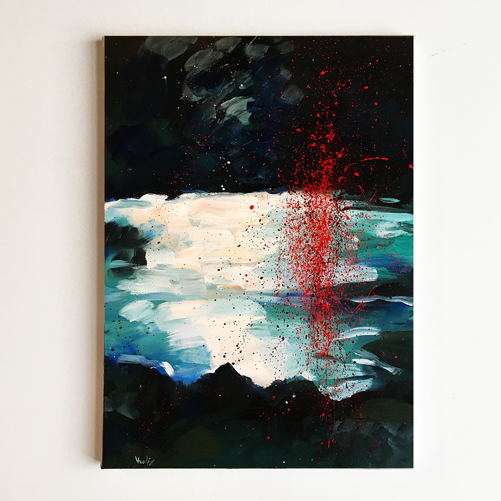
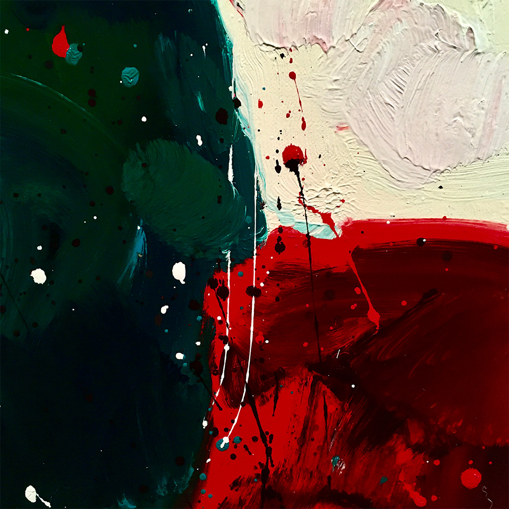
DRIPPINGS AND COLOR
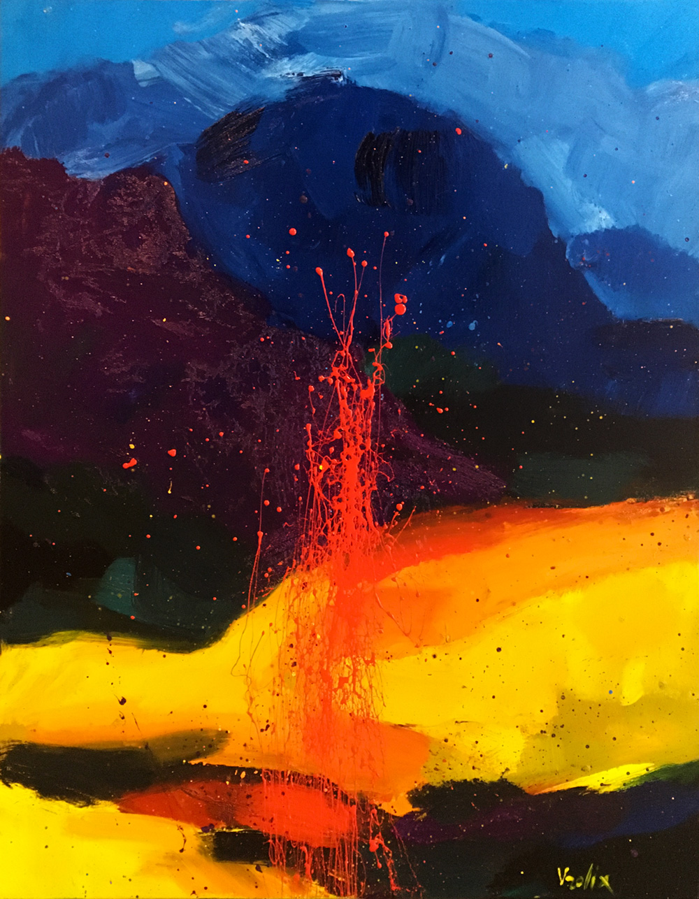
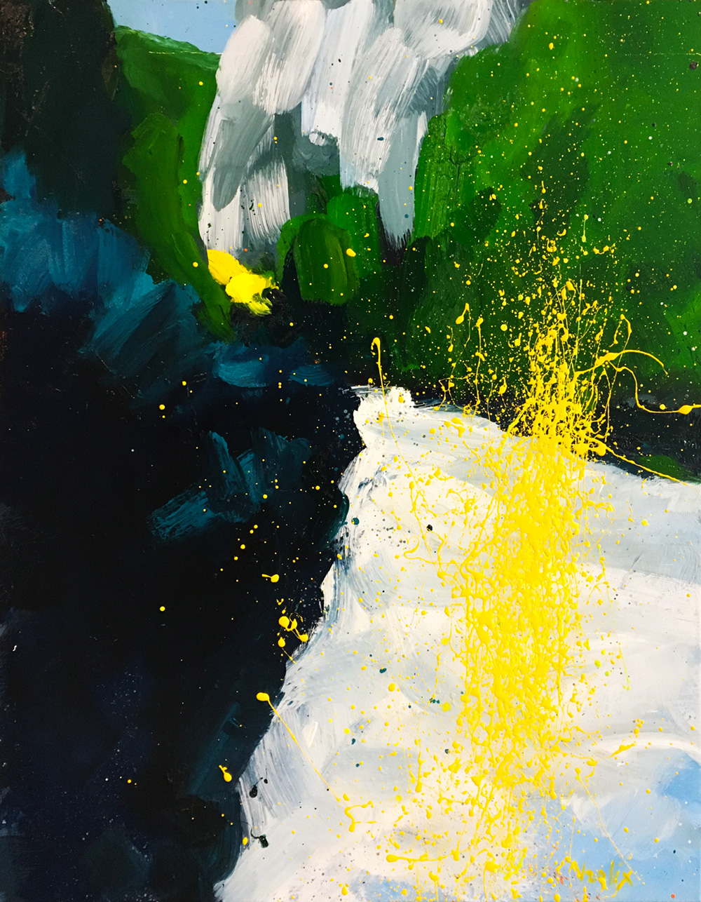
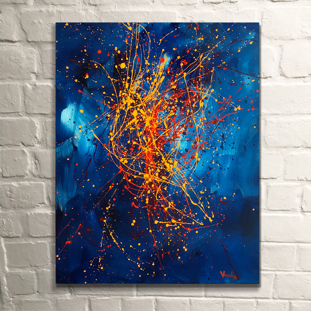
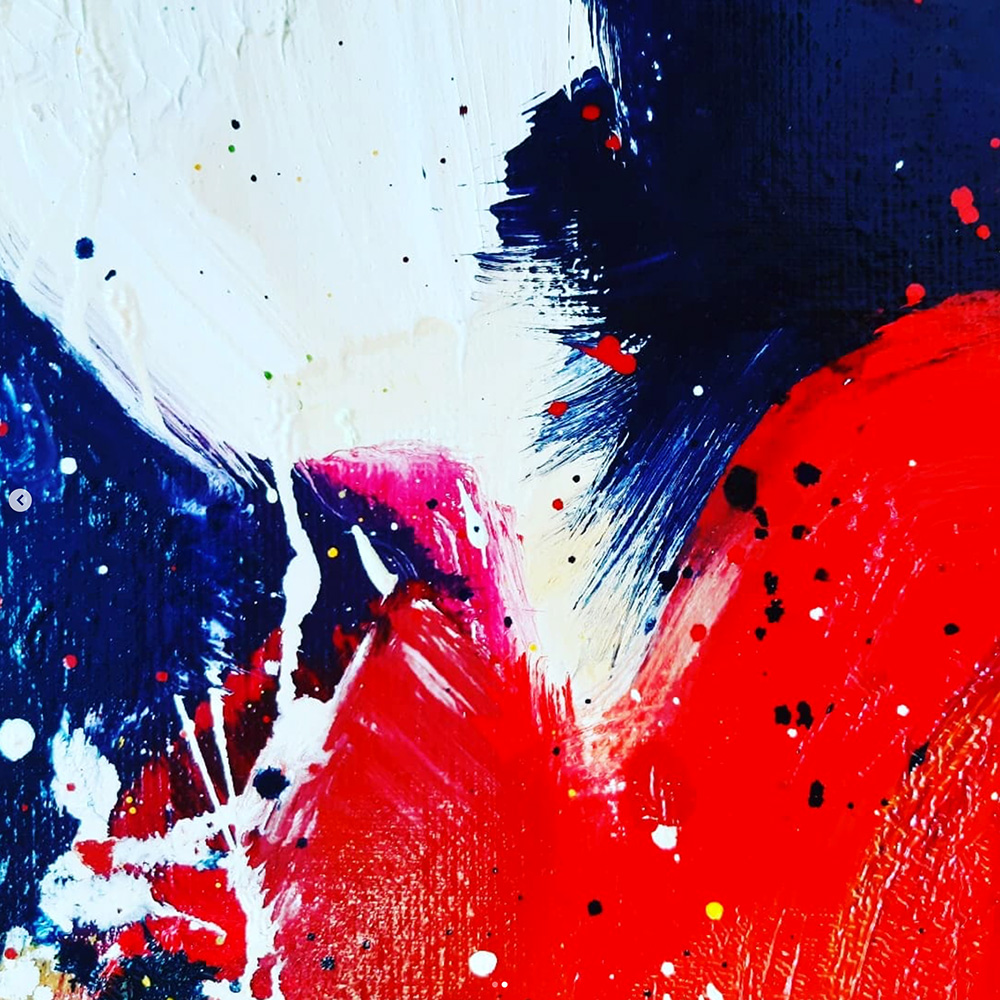
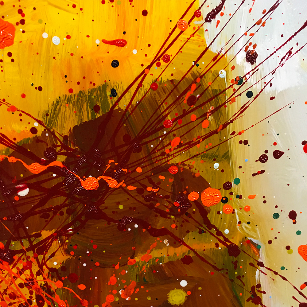
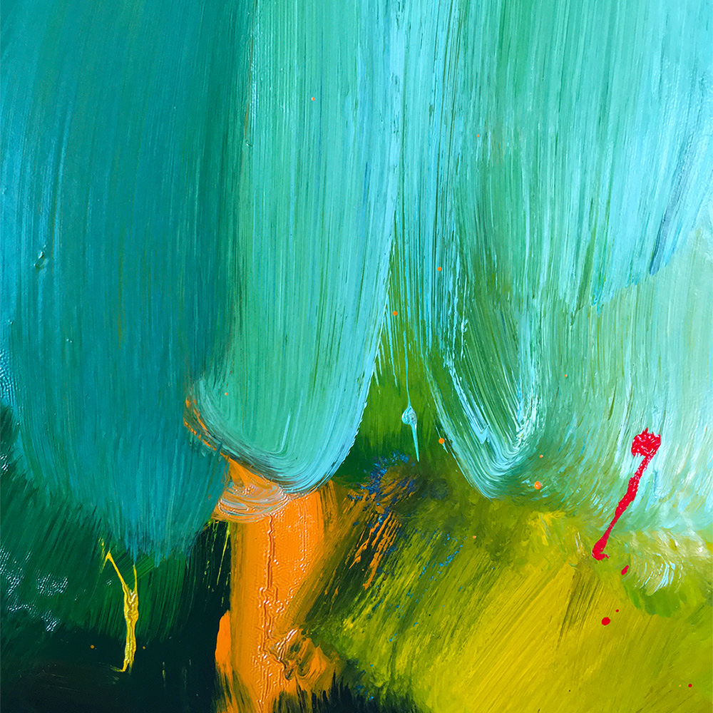
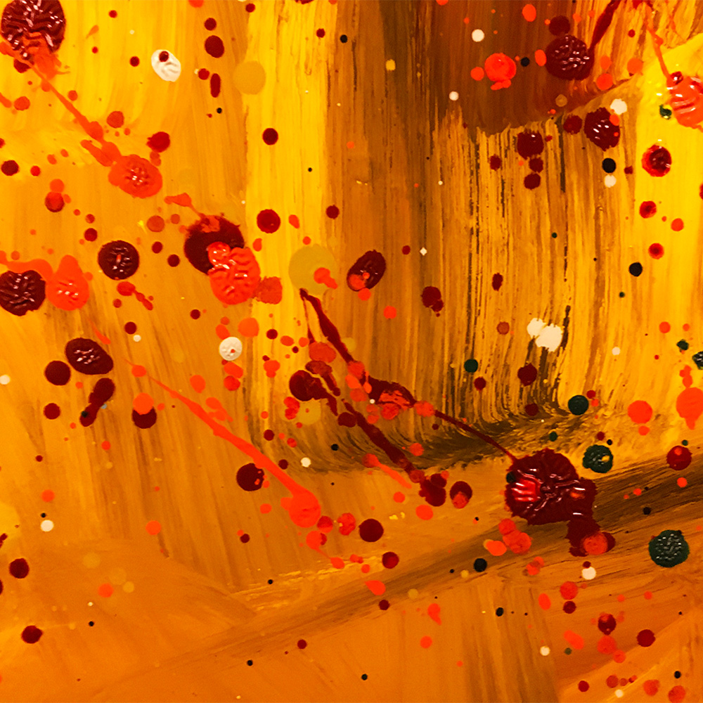
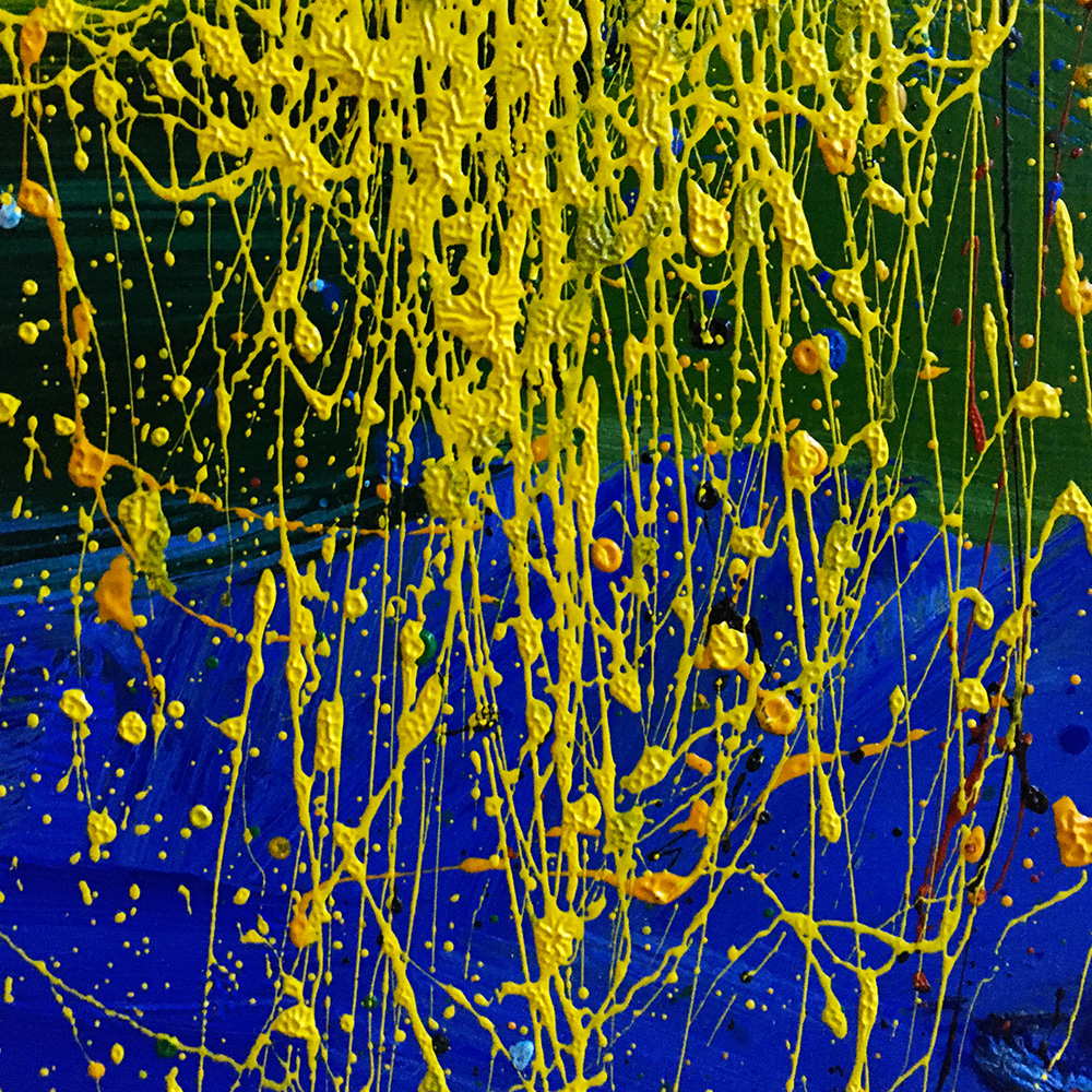
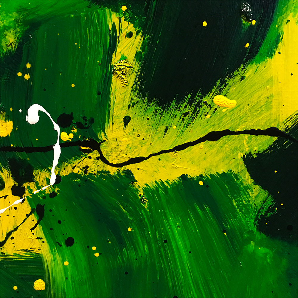
By using a glaze medium the oil paint became very liquid, hence my extensive use of drippings. For me they added an extra dimension to the painting. Although basically a fluke, a mistake, the drips and slashes were done on purpose, so they became part of the narrative. They added movement to the painting and movement meant time. Or to make it simpler, dripping's were just another way of adding colour to a painting.
"Memory In Pale Green" (first version, oil & glaze medium on canvas, 175 x 200 cm).
I loved color and all that dripping and splashing with paint was also pure color. Everything I had to say as a painter was inside my use of color.
"Memory In Pale Green" (second version, oil & glaze medium on canvas, 175 x 200 cm).
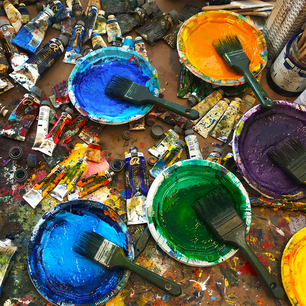
I was looking for a method how my handling of oil paint could come together with that of color. The way I did that was mixing the oil paint with a glaze medium, witch made the paint more liquid without diluting it while at the same time the glaze deepened the color.
"Memory In Orange" (oil & glaze medium on canvas, 80 x 100 cm).
A LABYRINTH REVEALED
The artist that I was looking at the most for this glaze technique was its inventor Jan Van Eyck. Not his narrative but what he could do with oil paint. No wonder he was seen by his contemporaries as a magician, an alchemist.
"Enigma" (after the central panel of the Ghent Altarpiece, from the Minotaur series, oil & glaze medium on canvas, 100 x 150 cm) as showed at a group show later in the year.
This series about the Minotaur was a classical theme for sure, but instead of concentrating on the bull (like Picasso for instance) I was much more interested in de actual labyrinth, which stood (for me) for the complexity of life. (The bull, as a danger, was symbolised by the splashes, if you like.)
"Minotaur I" (from the Minotaur series, oil & glaze medium on canvas, 70 x 90 cm).
HISTORY PAINTINGS
When I started to paint the colorfield paintings I already knew that they were only the first step in a long and intense process. Maybe it was good the notice that when I painted, I did that without the use of any dripping's or splashes, those always came later, sometimes a couple of days later, depending how satisfied I was with the work at that time. What that meant was these splashes weren't a case of poor paint handling but were painted or guided if you like.
As a painter one learns to use the coincidence, to foresee the unexpected. It's called artistry.
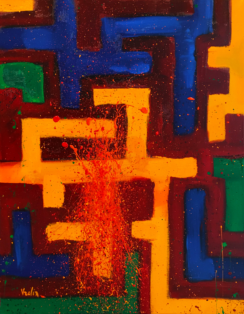
The colorfield painting eventually became the "ghost" paintings, although the Japanese name "Yūrei" was more in line with what I meant.
"Yūrei 1" (oil & glaze medium on canvas, 175 x 200 cm).
I saw the dripping's/lashings/sweeps as a form of identity, or maybe I should say, presence. They were in opposition to the subject, a way of painting that was of a different nature than how I handled the paint and color before in the same work.
"Yūrei 5" (oil & glaze medium on canvas, 180 x 180 cm), "Yūrei 6" (oil & glaze medium on canvas, 190 x 190 cm).
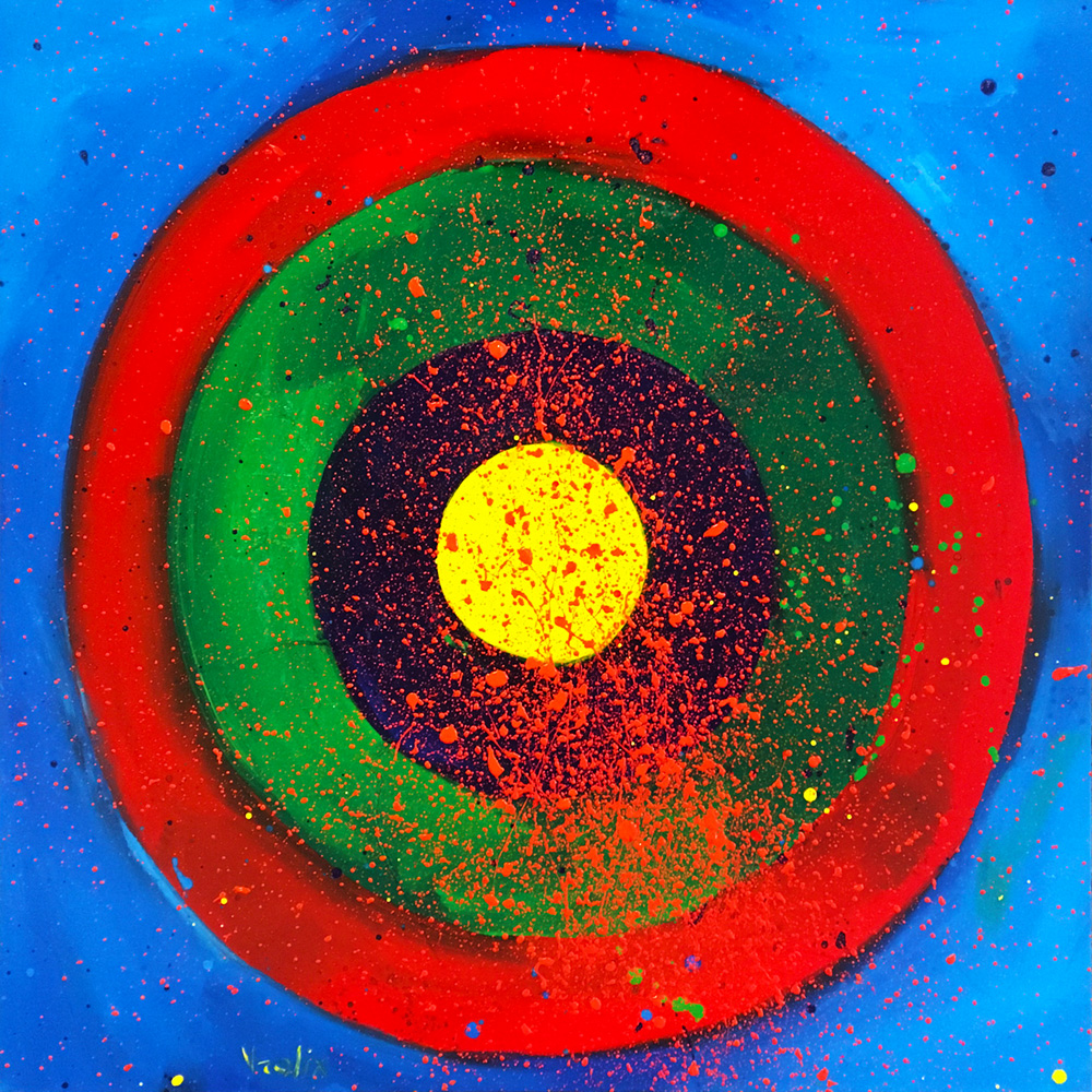
Like with the targets, these paintings were about the battle of color.
"Target" (oil & glaze medium on canvas, 80 x 80 cm).
Also the dripping's, splashing and slashes of different colors became their own reality inside the painting, like in the interiors.
"Yūrei 11" (oil & glaze medium on canvas, 120 x 150 cm).
"Yūrei 9" (oil & glaze medium on canvas, 70 x 900 cm).
The degree of abstraction in my paintings was as far as I could take it without losing its meaning. I never felt any conflict between the two, I only desired reality (in more then one sense), not some painted theoretical ideas.
"Yūrei 7" (oil & glaze medium on canvas, 175 x 200 cm).
A SPACE INVADED
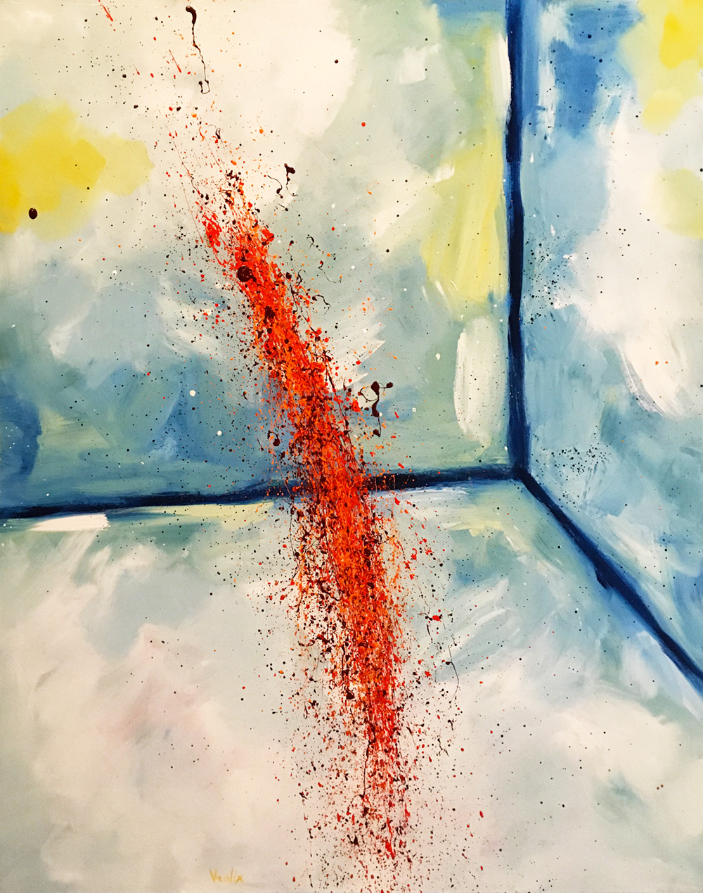
By March I arrived at the last painting of the colorfield paintings. Not that I knew that of course. I came to realise that the moment I finished the painting "Homerun". It still belonged to the colorfield series but was also already different.
"Homerun" (oil & glaze medium on canvas, 130 x 165 cm).
After that my way of painting became more loose, more intuitive and more confident. I suppose I just trusted myself more.
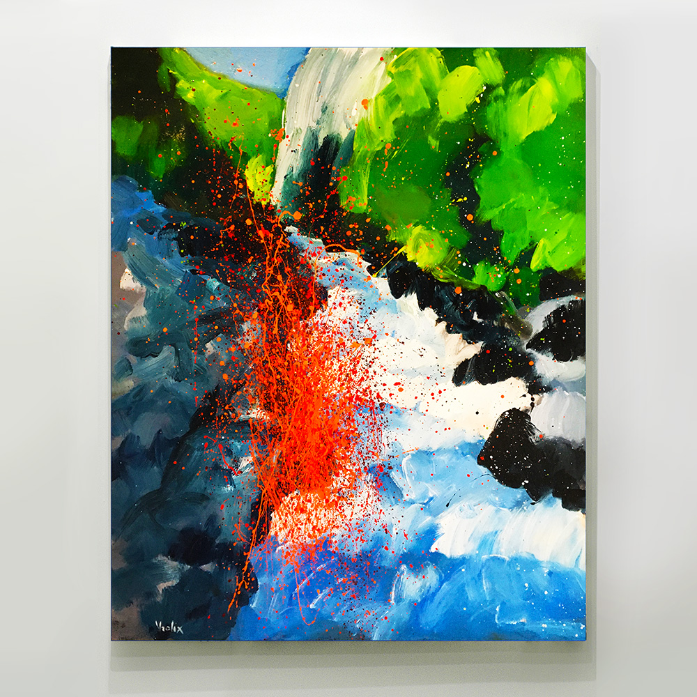
"Before The Storm" (oil & glaze medium on canvas, 170 x 170 cm), "Water Falling" (oil & glaze medium on canvas, 160 x 180 cm).
After these three paintings I wanted to dive into some serious landscape painting.
"House By The Lake" (oil & glaze medium on canvas, 120 x 160 cm).
LANDSCAPES HAVE IDENTITY
I started to do a series of small landscapes to see where that would lead me, but it was the decision to turn to reality that was the most radical.
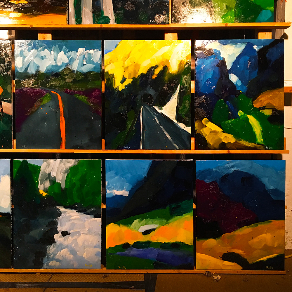
This series were all around 70 x 90 cm, not much bigger. It gave me opportunity not to overthink it while giving me a speed that's hard to maintain on a larger scale.
"Spring Valley" was the first one in this series that I considered finished, and by that I meant good enough to trigger some basic rules, at least for a while.
"Spring Valley" (oil & glaze medium on canvas, 70 x 80 cm).
If you paint a portrait, you actually paint two individuals, yourself and that of the sitter. With a landscape it was very much the same, for me they were just as individual as any person. They had an identity. I wanted to paint landscape portraits.
"Meadow" (oil & glaze medium on canvas, 70 x 90 cm).
Painting these landscapes I almost immediately noticed that my hand became more loose, more fluid. Landscapes made me feel more free. Made me paint like the landscape itself.
"Winterbourne" (oil & glaze medium on canvas, 70 x 80 cm).
All the colorfield paintings I had done from a sort of memory, an abstraction of what I saw in my mind. With the new landscapes I changed that and decided to do them from reality, or at least pictures of it. Anyway, they were all existing places.
"Paradise Lost" (oil & glaze medium on canvas, 162 x 162 cm).
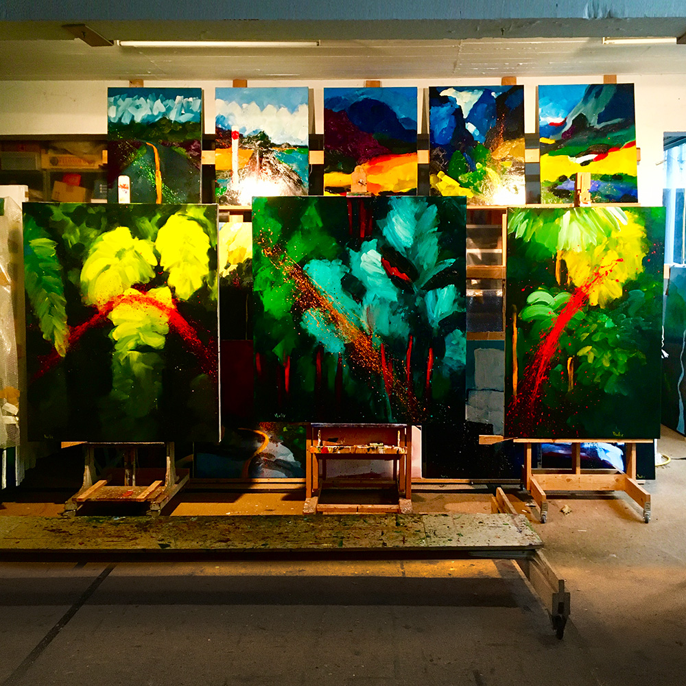
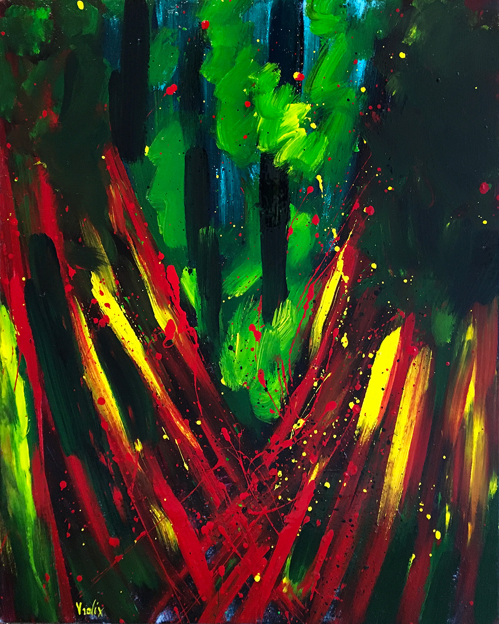
Some paintings from the jungle paintings.
“The Pond" (oil & glaze medium on canvas,120 x 150 cm), "Undergrowth" (oil & glaze medium on canvas, 135 x 140 cm), "The Snake" (oil & glaze medium on canvas, 100 x 150 cm).
The last landscapes (of what now became became quite an extensive series), were all about rivers and roads.
"A River Runs Through It" (oil & glaze medium on canvas, 120 x 150 cm).
"Full Moon" (oil & glaze medium on canvas, 100 x 140 cm).
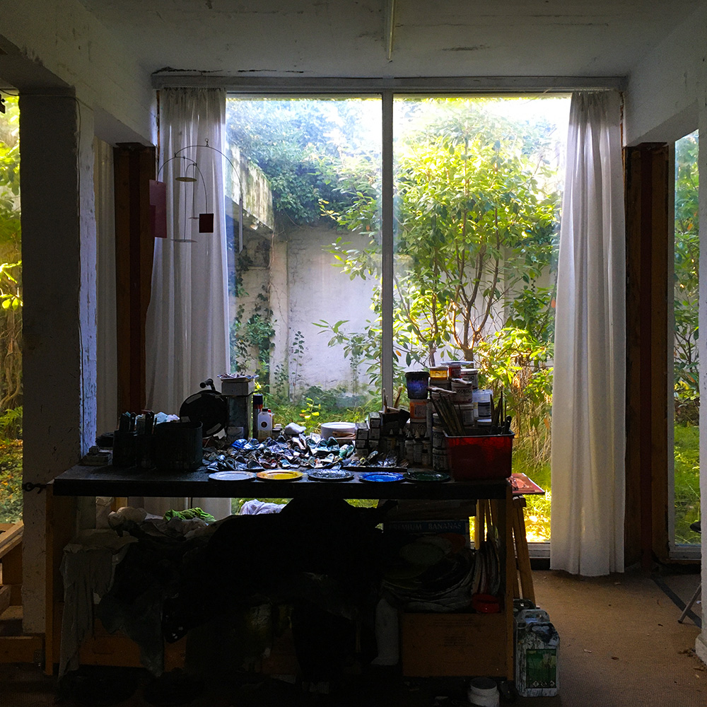
I usually did not paint "au plein air" but I thought giving it a try, albeit with a twist. The painting was still based upon a photograph while doing the actual painting in my studio garden.
My little "au plein air" experiment.
"Where The Forest Begins" (oil & glaze medium on canvas, 100 x 120 cm).
It seemed fitting that, what turned out to be the last of the landscape paintings, would be the biggest. Although size doesn't matter, it didn't do the grandeur of the maintain valley any harm, quit the opposite.
"Wildflowers" (oil & glaze medium on canvas, 195 x 240 cm).
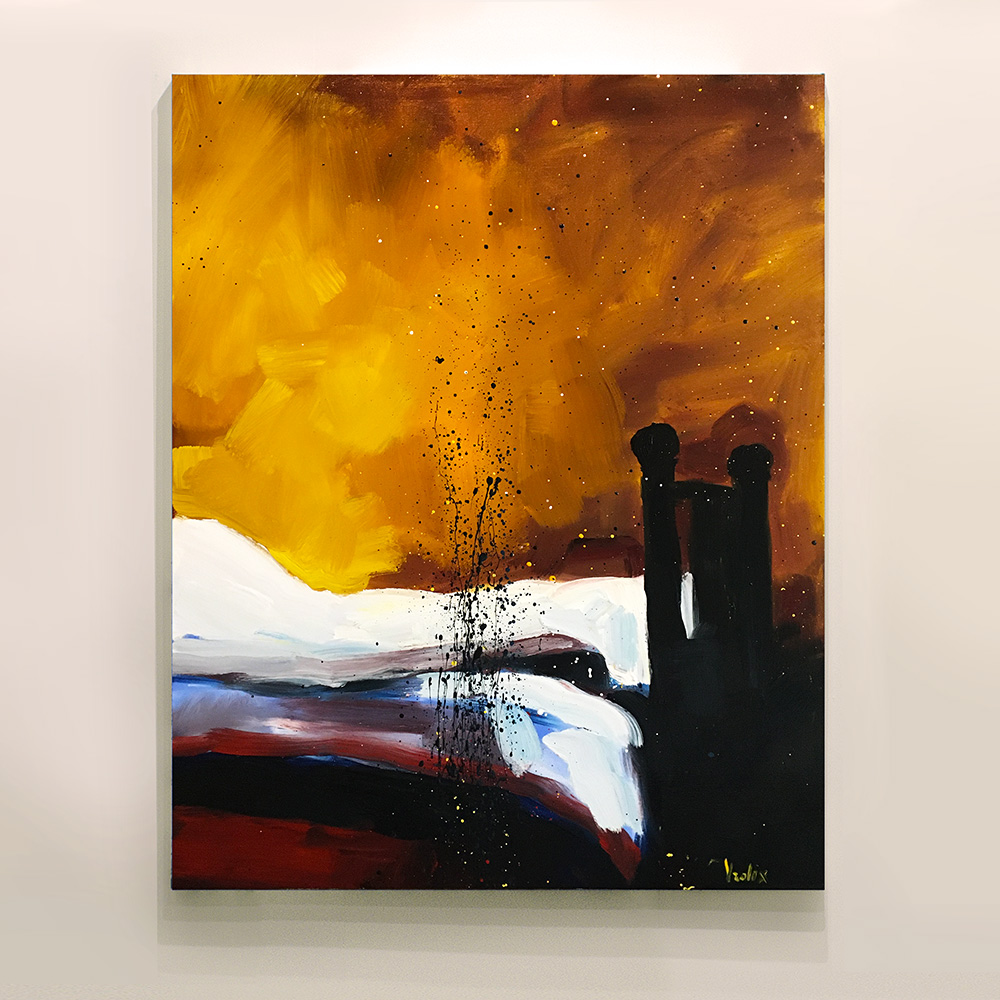
BEDS ARE INDIVIDUALS
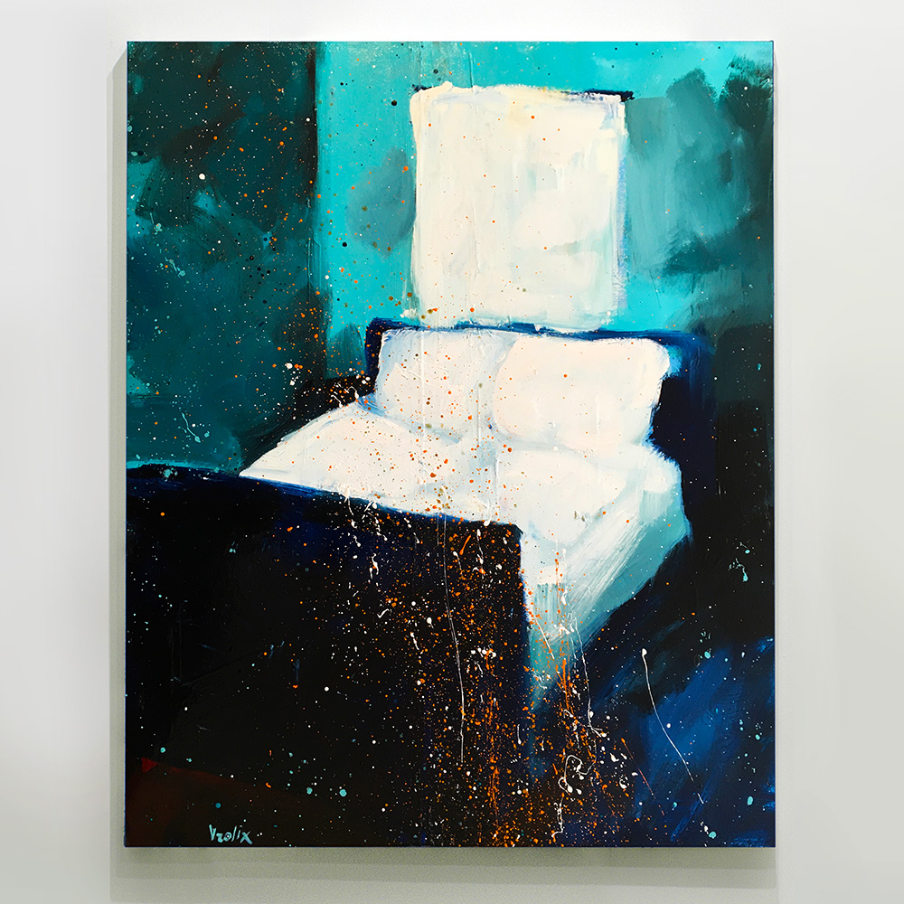
I painted a few inner-landscapes to. All of them had a bed as subject and were based on photos of real bedrooms.
"First Light" (oil & glaze medium on canvas, 80 x 100 cm).
"Unmade" (oil & glaze medium on canvas, 80 x 100 cm).
Preparing dinner 🔥 Creating sculpture!
I am a painter and as a painter I never looked for beauty or importance. My only goal was to paint something unique, something that irritated the viewer, something like reality.
The new is never found in conformity. Today it seems, the whole social background over the last decades is about ideology, that demand not to make any mistakes and to do the right thing at all time, whether it's about the relationship between men and woman, between black and white or old and young. Its something artists can't really contribute to, but unfortunately, most artists do and they all tend to conform. At the Venice Biennale or the Documenta, you can see it there, that very unfortunate need to conform.
An artist must never conform or be moralistic, he (or she) must at all times be amoral.
Some lockdown rules were lifted after a while. Theatres and cafes opened again, a bit like a virgin going to her first party. Still, many rules stayed in place. Anyway, I finally got a new assignment for a set design, the play "Alles In Brand!" (On Fire!). - But, just as the year before, with a serious reduced payment. Nothing as a good pandemic to reduce wages, I always say!
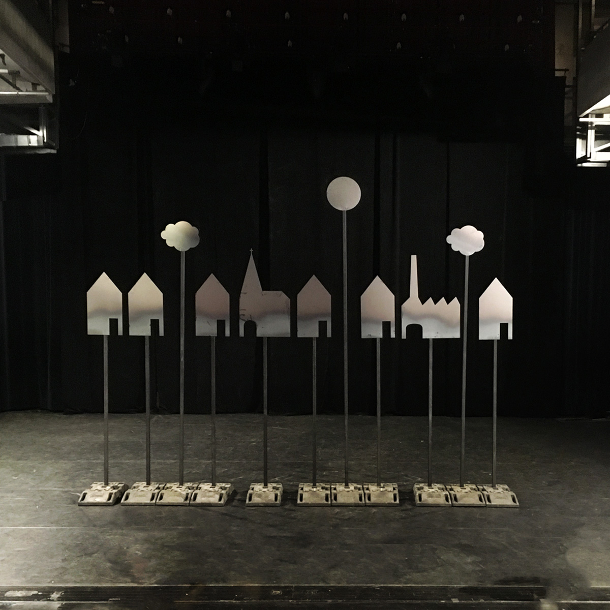
Because the story of the play took place at the fire department, I visited the real thing and eventually decided the set should be made out of steel. Although I first wanted give them a color (red and yellow of course), I liked the natural look of the steel so much, I finally decided against it. I wanted to create a horizon line of a cityscape. And that’s what it ultimately became.
What this play meant to me was that the "fire" actually happend between people inside their houses.
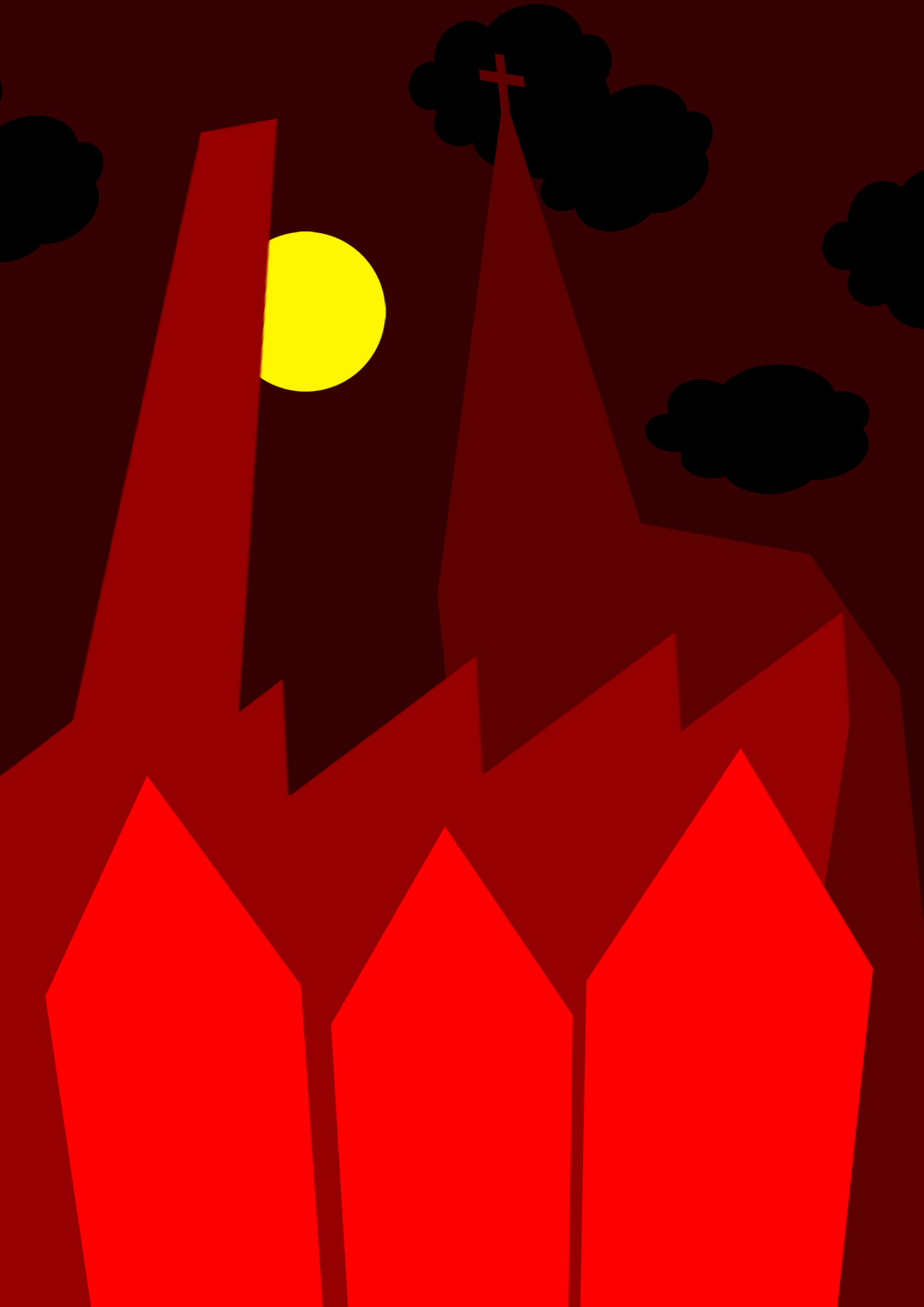
Poster design for "Alles In Brand!".
Other poster design followed, "Speeltijd!".
For the poster design of "Monkey Puzzle Tree" I didn't had to look very far, I thought.
Poster design for "Monkey Puzzle Tree".
"Verkeerde Nachten" was the poster design for another upcoming play, fingers crossed, this time based upon the graphic novel "Van Bevers Square" I created (and published) in 2016 for which Arne Sierens had written the text and story.
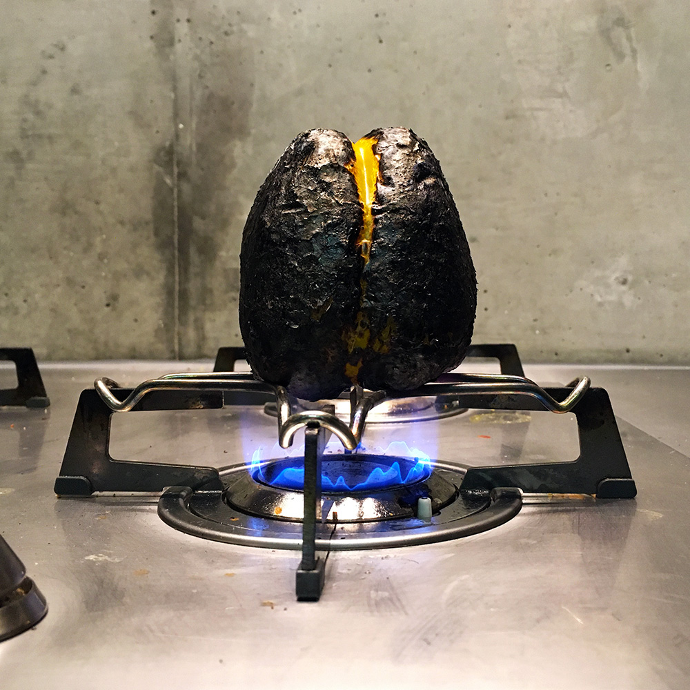
Black garlic, tasted like candy and balsamic, yummy!
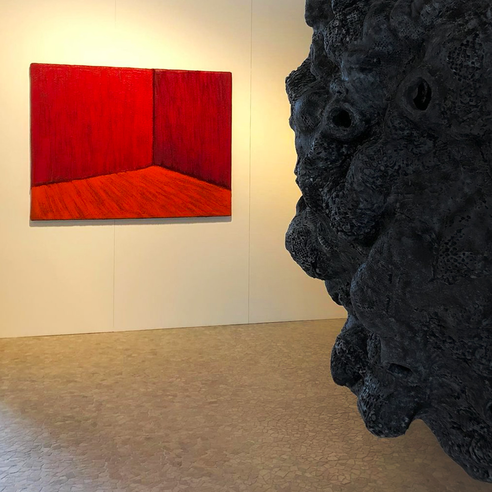
Not that nothing ever happened in the art world for me but covid-19 kept making life difficult. Initiatives were taken, people tried but it was all on a rather subdued scale. Never the less, I did had a solo show at a group show of galleries in Antwerp. The gallery insisted showing some of the older fur-paintings.
Fine by me, older was better than none.
"Red Room" (oil on artificial fur, 135 x 175 cm, 2010).
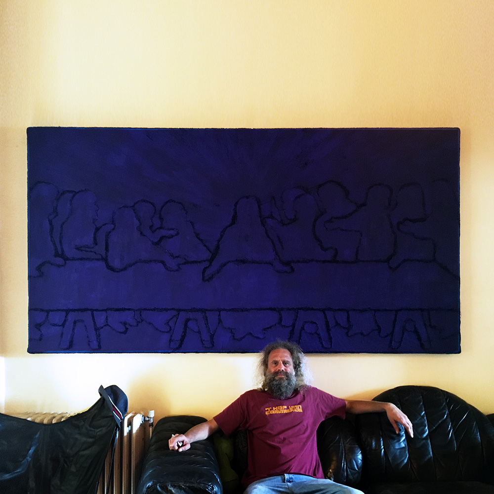
Sometimes my work goes to the most unexpected people.🤘
"Blue Last Supper" (oil on artificial fur, 140 x 260 cm, 2019).

In contrast to Van Eyck whose work I admire for their technique and even today, modernism, time and time again I returned to my ultimate favorite artist, Bruegel (the Elder), because I was fascinated by what he painted.
"Harvesting" (oil & glaze medium on canvas, 174 x 190 cm).
As I said before, the dripping's had also a different secondary function inside the painting, that was to be in the way so that it forces the viewer to pay more attention to the painting itself. (Imagine holding a hand up in the line of sight during a conversation, that will force the other to concentrate more in order to ignore the annoying hand.) To be honest, it's a trick as old as painting itself.
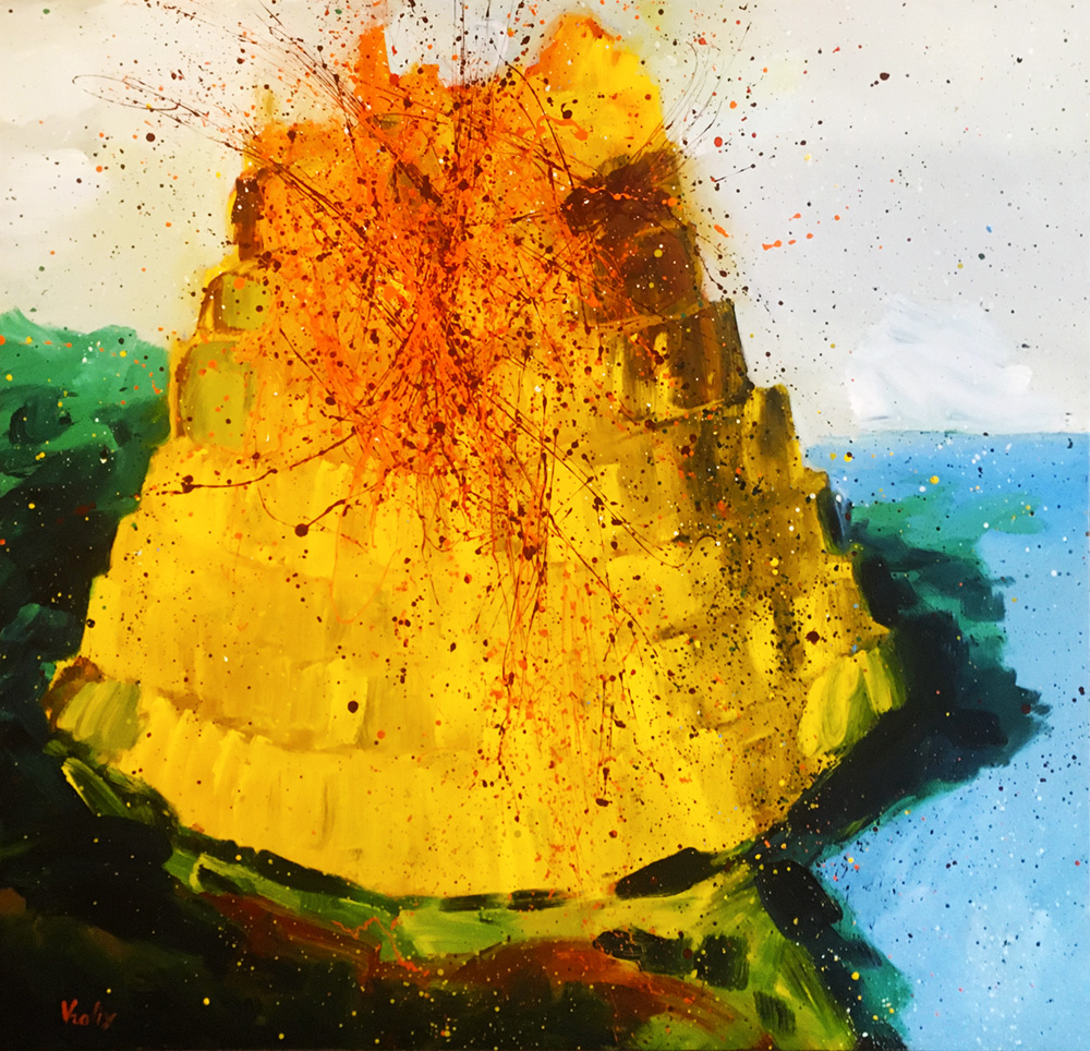
"Tower of Babel" (oil & glaze medium on canvas, 136 x 141 cm).
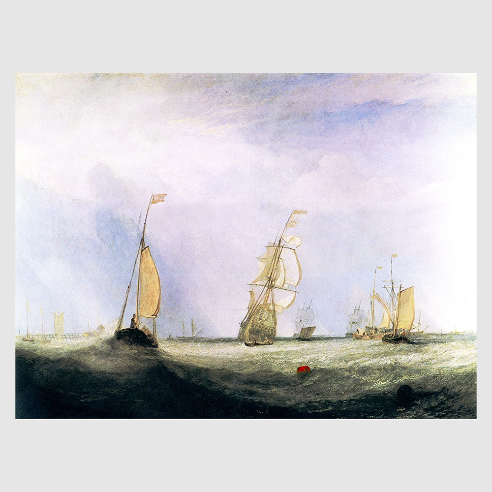
An example of how to force the viewer to pay more attention to the painting was the famous story of Turner and Constable.
"Helvoetsluys" is a subdued and subtle painting, which is important because of the role it played in an incident between Turner and Constable, at The Royal Academy's exhibition in 1832. It was hung next to Constable's painting which featured a lot of strong reds. On varnishing day, when painters were allowed to add finishing touches to their paintings, Turner came into the gallery, contemplated Constable's picture for a while, left the room and returned with his palette. He added a blob of red lead paint to his own picture and fashion the blob into a buoy, much to the consternation of those present, including Constable, who said "Turner has been here... and fired a gun!"
J.M.W.Turner, "Helvoetsluys", 1832.
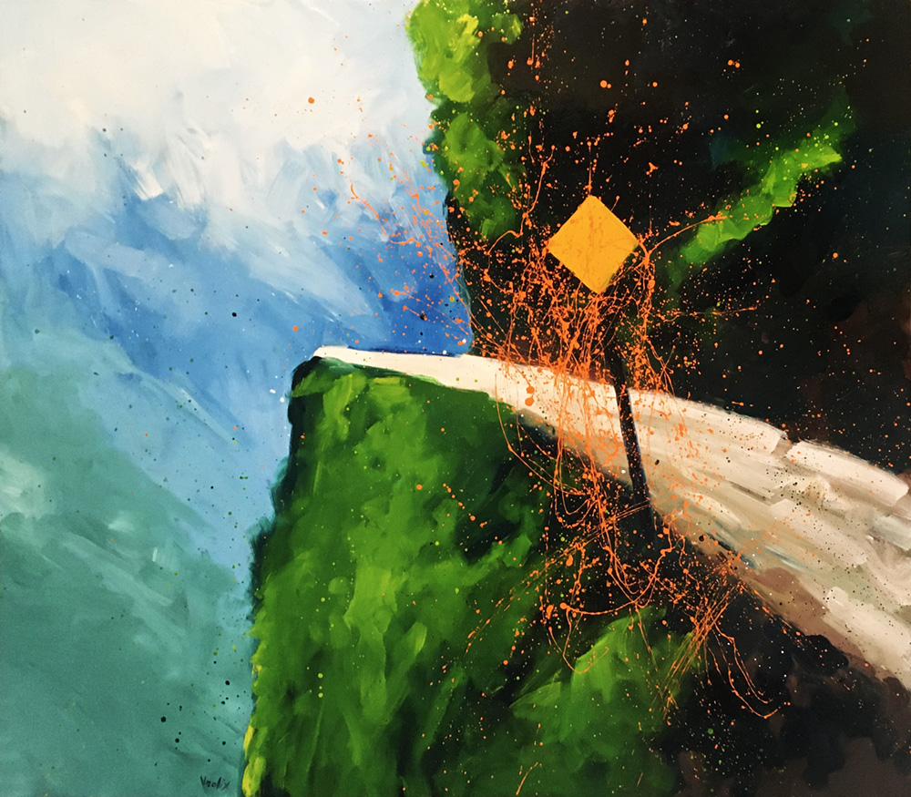
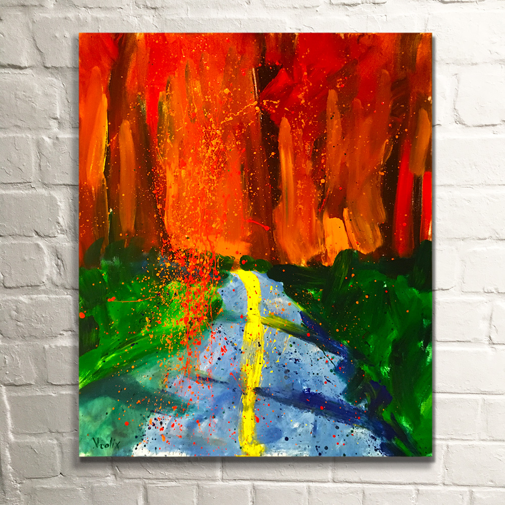
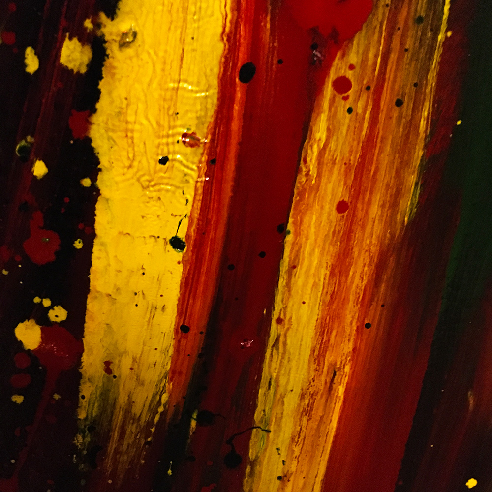
The painting "Pass Orange" didn't came directly from Brueghel but was based on a photo that reminded me strongly of his work, especially those of his travel thru the Alps on his way too Italy. This precarious road was in the Andes though.
"Pass Orange" (oil & glaze medium on canvas, 175 x 200 cm).
It became clear to me that in a landscape the usage of dripping's had a different sort of reality than in figure painting. I named them my Gardens of Eden paintings.
"Sunset" (oil & glaze medium on canvas, 70 x 90 cm).
First I painted these works from memory, just as had done with the colorfield paintings, but soon something was bugging me.
DEALINGS WITH THE PAST
In the painting "Fading Memories" I tried to understand and show this terrible disease called Alzheimer. (My mother.)
"Fading Memories" (oil & glaze medium on canvas, 100 x 120).
It's not that I didn't like them, I just realized that they simply were not "real" enough. Since I did already all my landscapes based on (photos of) reality, these paintings became to me too theoretical.
"Infected" (oil & glaze medium on canvas, 100 x 120 cm).
DRIPPINGS CARRY MEANING
I had to clear my head. To stay a bit with the theme I did a couple of works named "Gardens Of Earthly Delights”, a background with only dripping's. I left out the model so I could figure out if the problem was with the model than with the dripping's.
"The Garden Of Earthly Delights - Act 1" (oil & glaze medium on canvas, 70 x 90 cm).
Another painting from these so called garden series was "Roots" (oil & glaze medium on canvas, 80 x 100 cm).
HIDDEN TRUTH REVEALED
Since I started to do these latest series I had made the decision that I only would paint reality, be it a landscape or figure, thru photographs. I preferred photos because I needed a buffer, some sort of filter to shield myself from the influence of a beautiful landscape or model. I needed inspiration not influence.
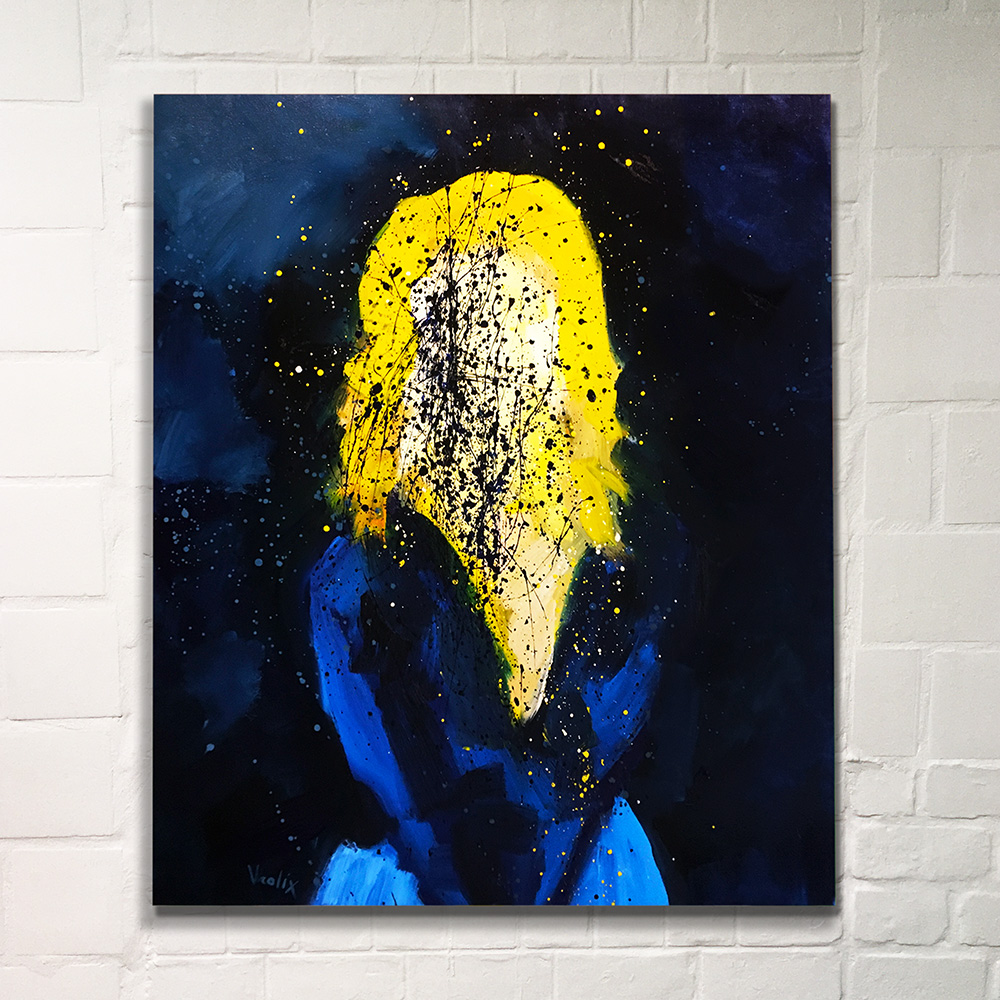
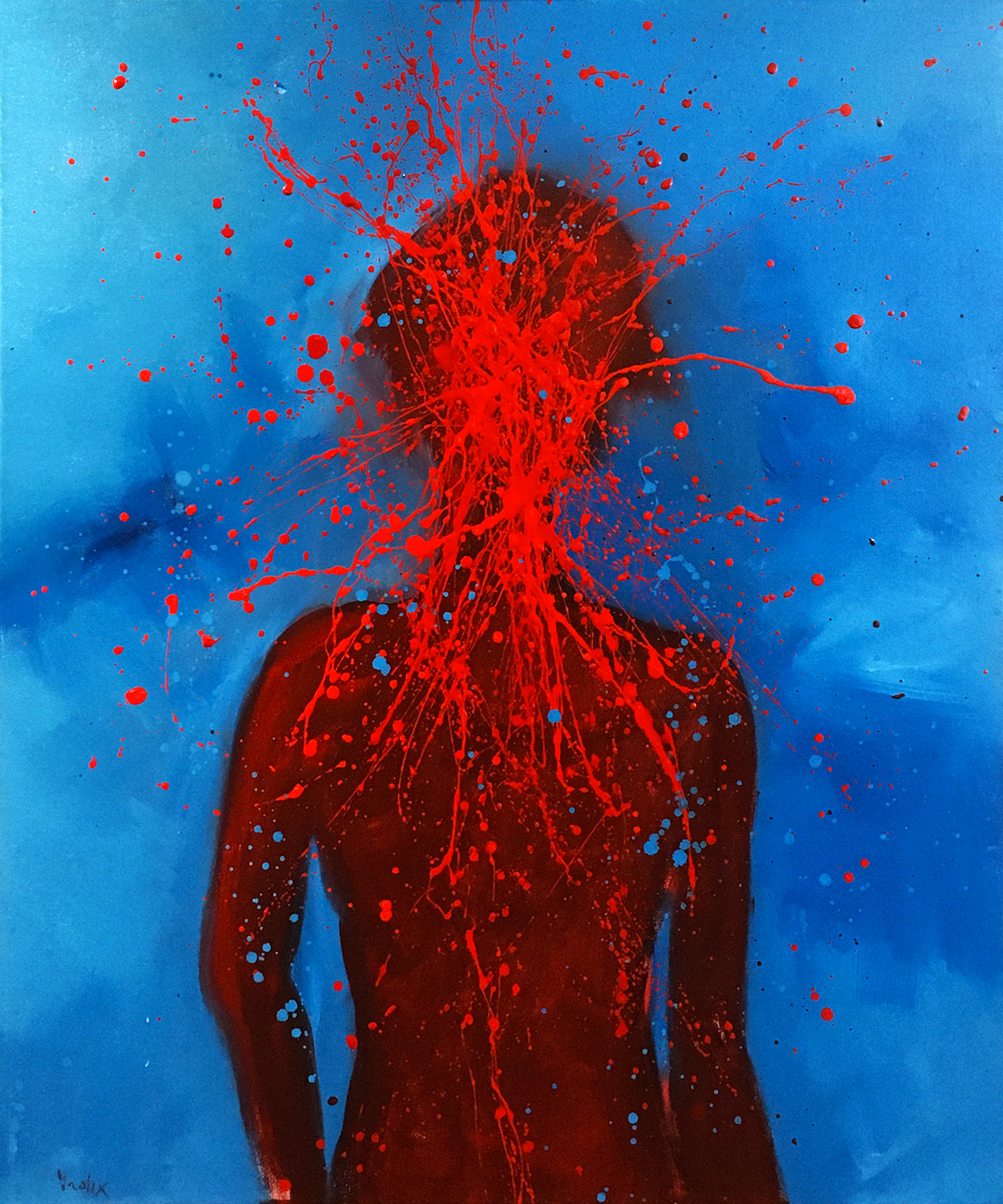
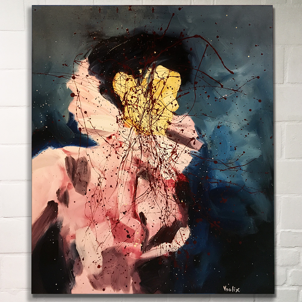
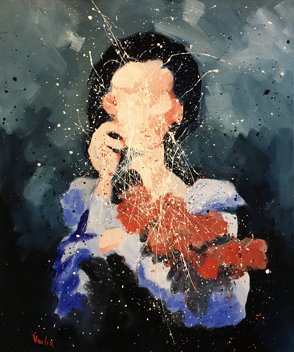
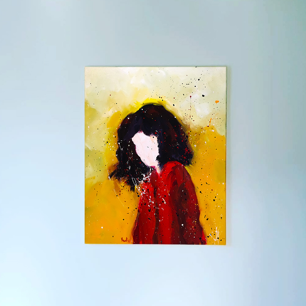
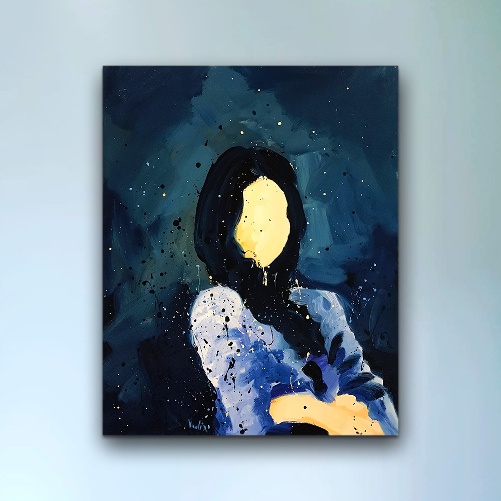
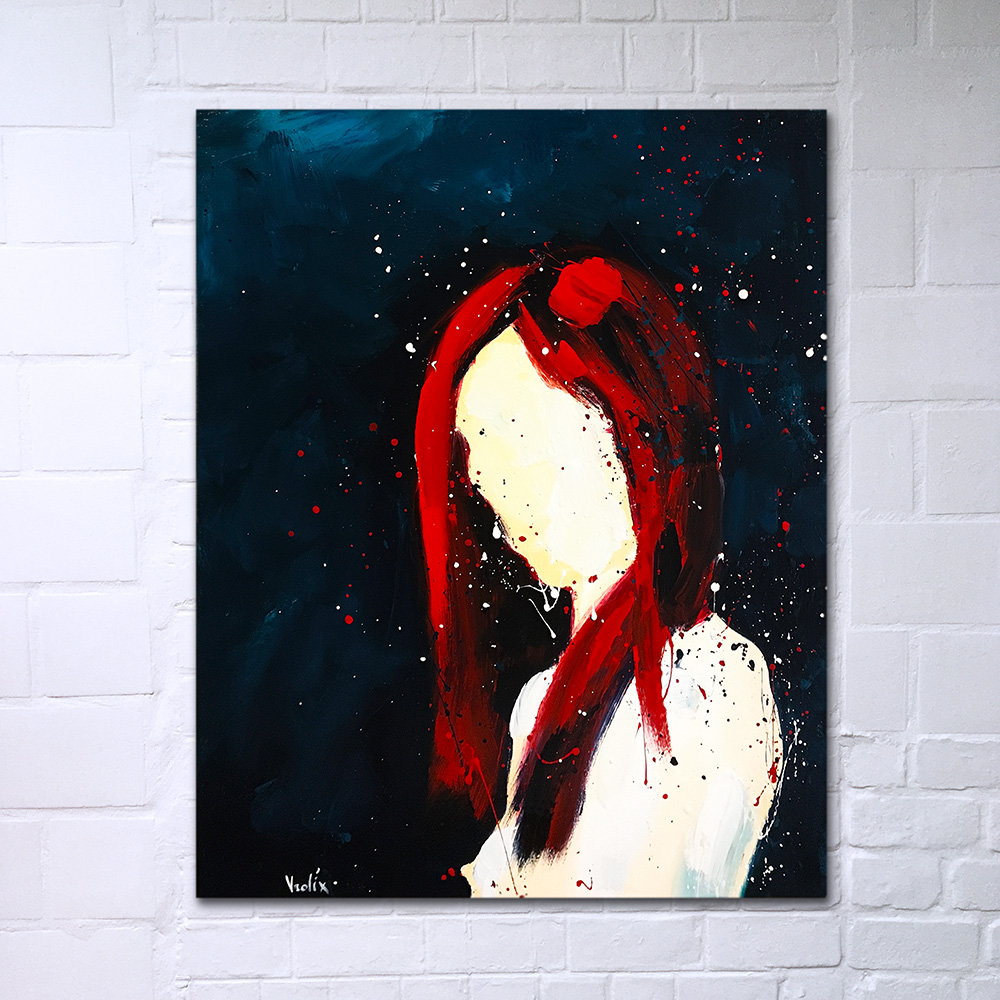
Which lead me straight to the next problem, namely that of the face. I have to elaborate here a little. With a face I meant that every picture of a model shows an individual, an identity if you will. As an artist I was only interested in the painting itself. Identity stood in the way of seeing that. Exit the face.
I made it my task to show identity through my handling of the oil paint, dripping's included.
"Blind" (oil & glaze medium on canvas, 100 x 120 cm).
I always liked historical portraits, hence this painting of a woman with a ruff (albeit a modern one).
"Ruff" (oil & glaze medium on canvas, 100 x 120 cm).
This one I particularly liked because of the brushwork (dripping's and slashing included) that had a natural flow. There was no problem to individualise the girl, even without her face.
"Girl with Flowers" (oil & glaze medium on canvas, 100 x 120 cm).
THE SELF IS A SURFACE
A second series of portraits followed soon, even though I changed the dripping technique somewhat.
I decided to call this series "Colors".
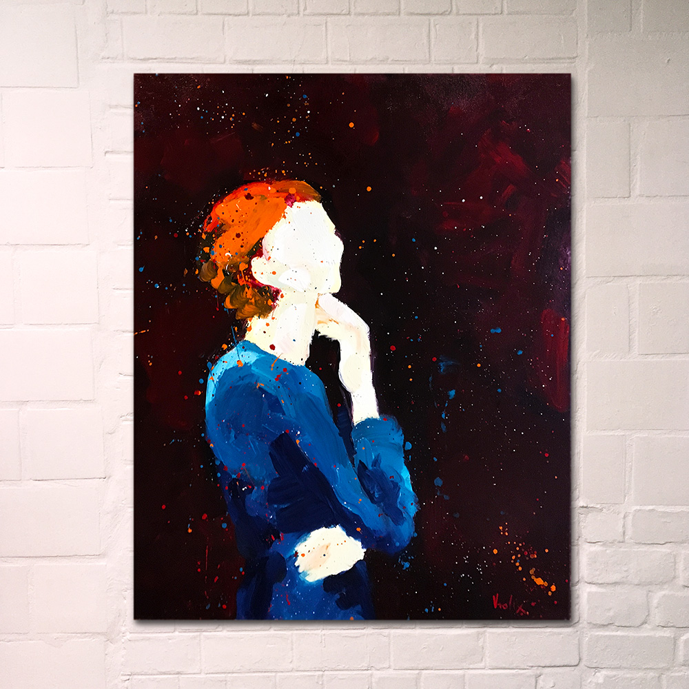
"Indigo" (oil & glaze medium on canvas, 80 x 100 cm).
"Red Scarlet" (oil & glaze medium on canvas, 80 x 100 cm).
I found it to be a strange experience to find these paintings to be... well, beautiful, I guess.
"Orange" (oil & glaze medium on canvas, 80 x 100 cm).
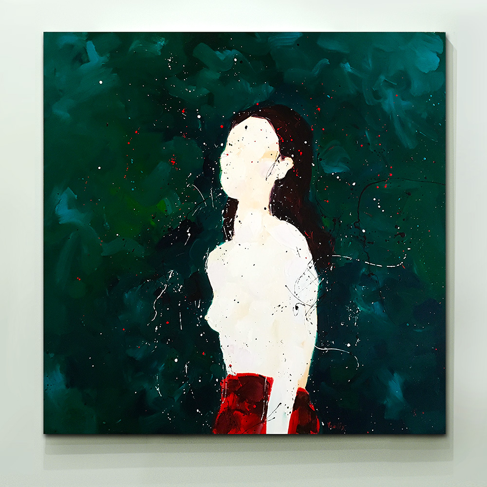
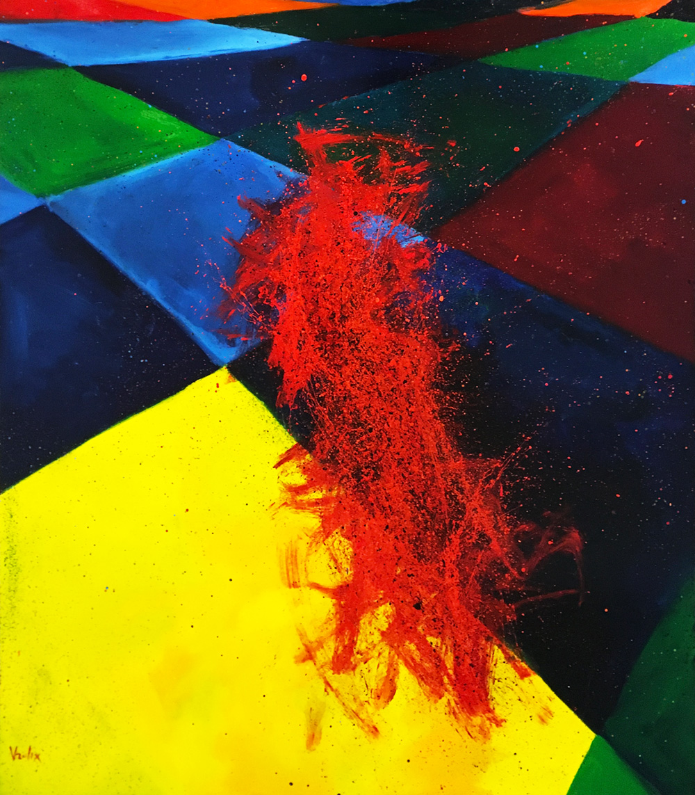
"Green" was one of those works were everything came together, color, movement, dripping, meaning and statement. All in all I was very happy with this series.
"Green" (oil & glaze medium on canvas, 160 x 160 cm).
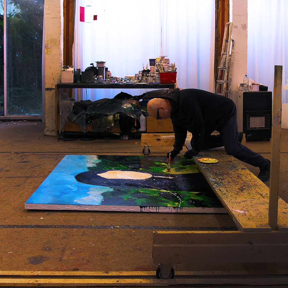
Then I did the paintings "Symphony In Green", with which I meant a place not the color.
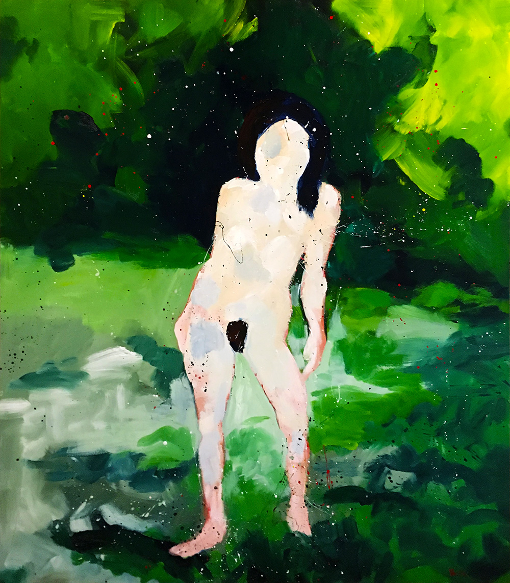
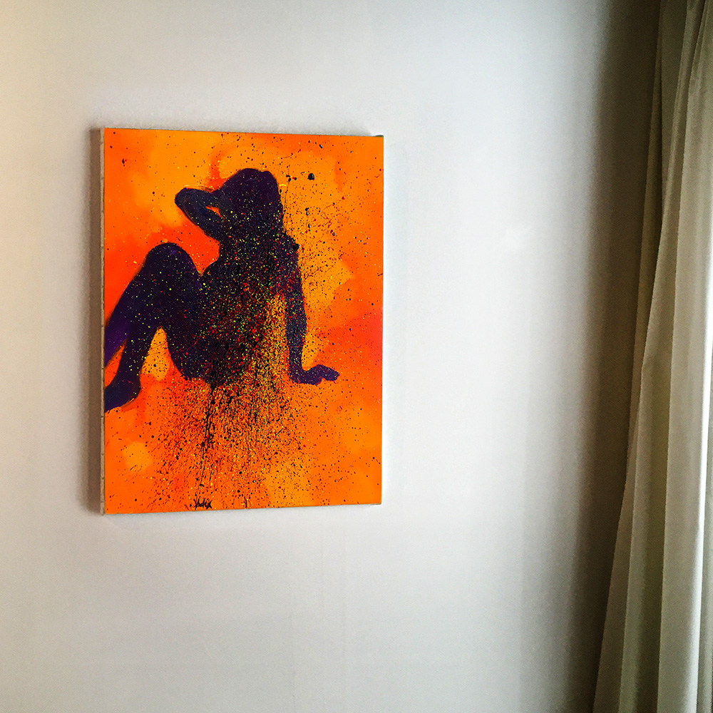
My first "big" nude in a while.
"Venus In Green" (oil & glaze medium on canvas, 175 x 200 cm).
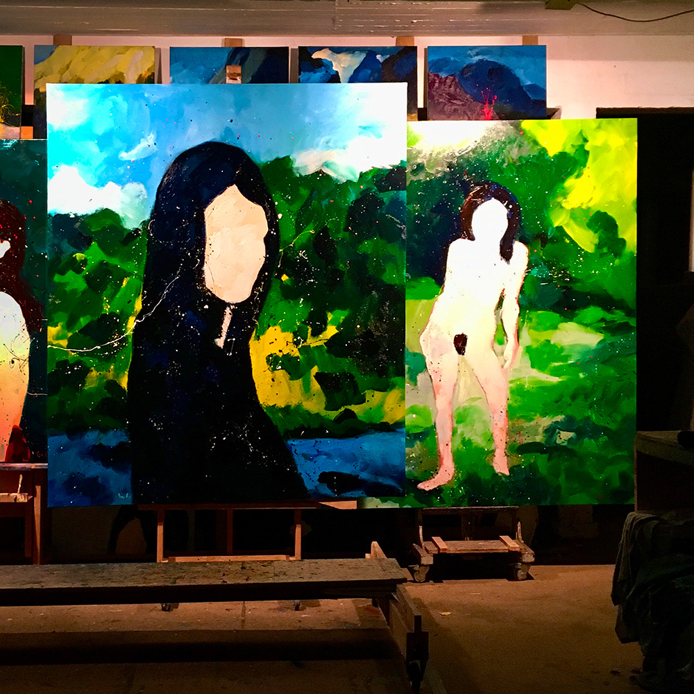
They eventually became a diptych.
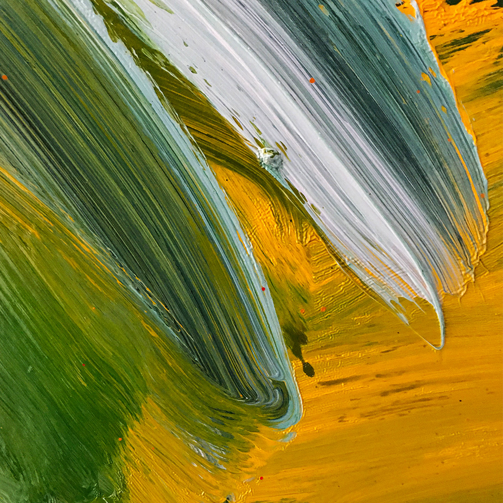
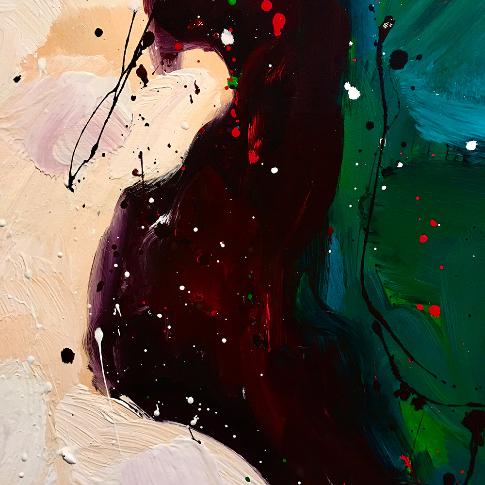
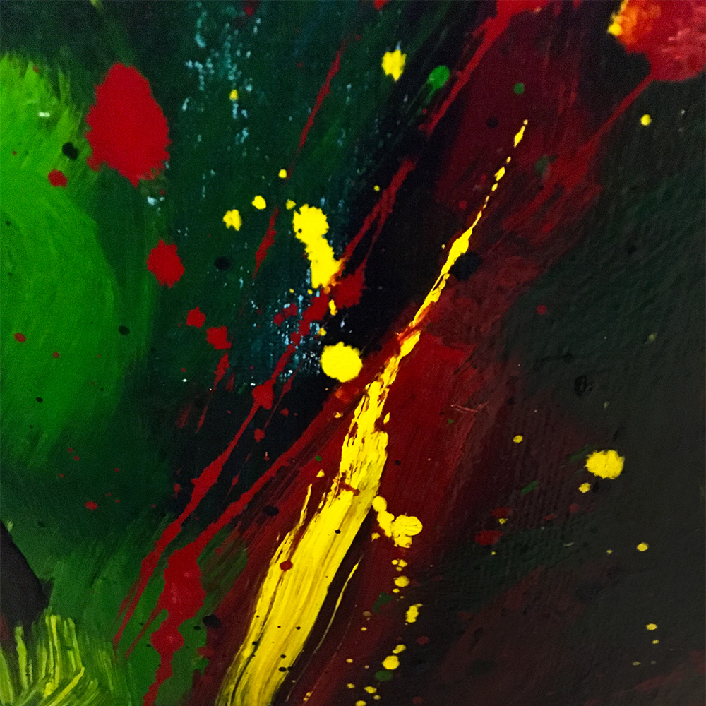
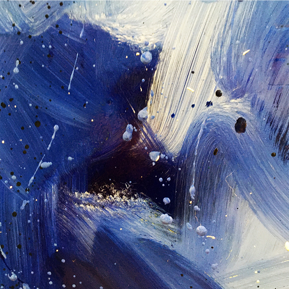
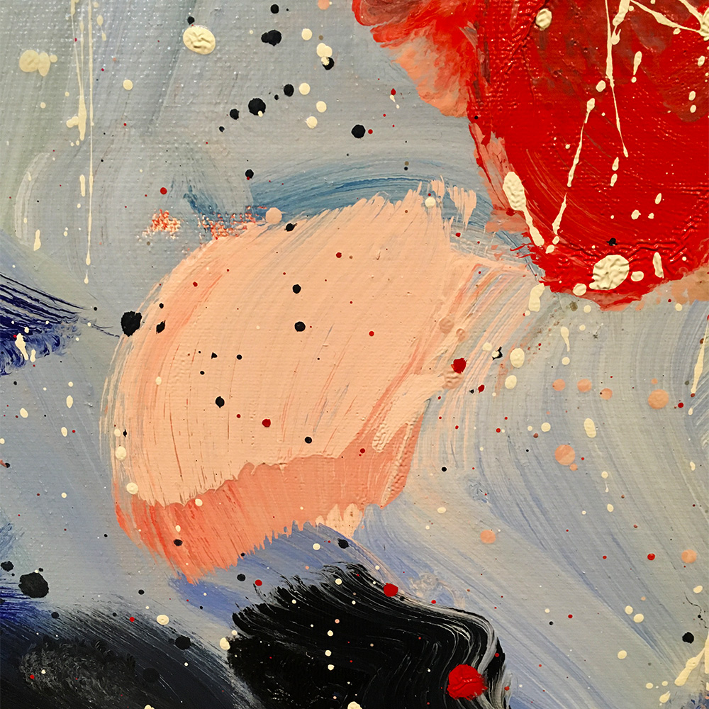
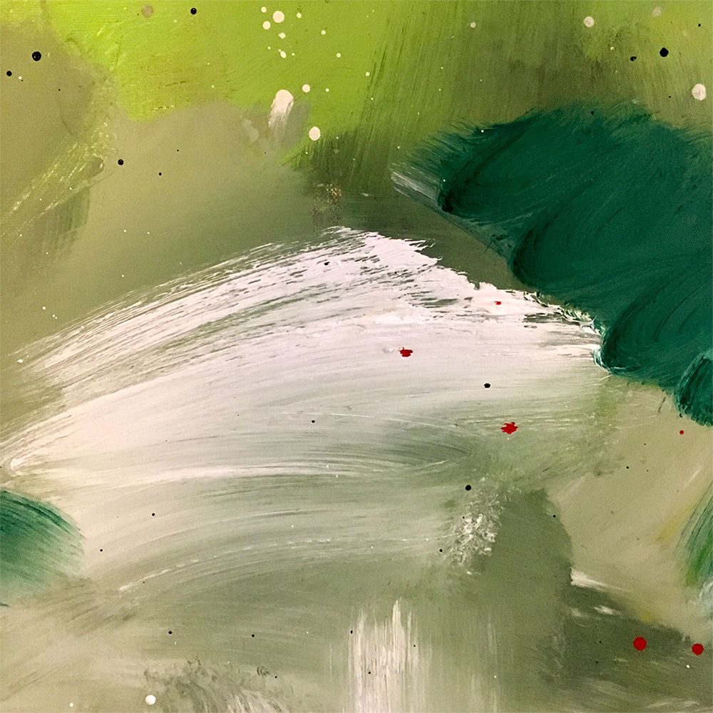
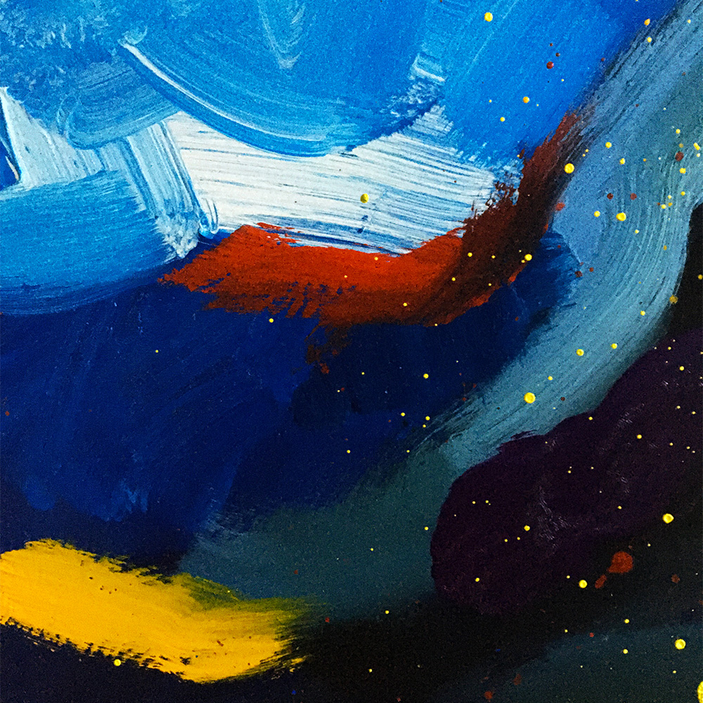
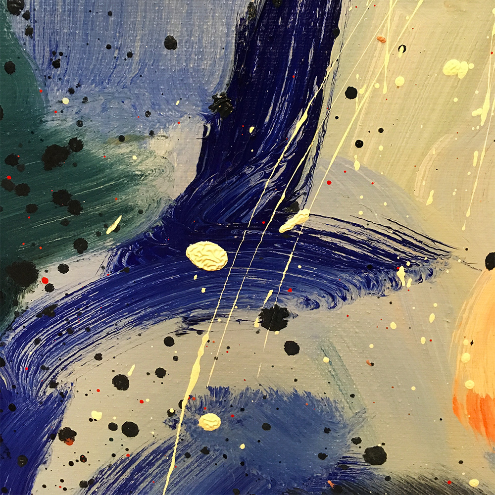
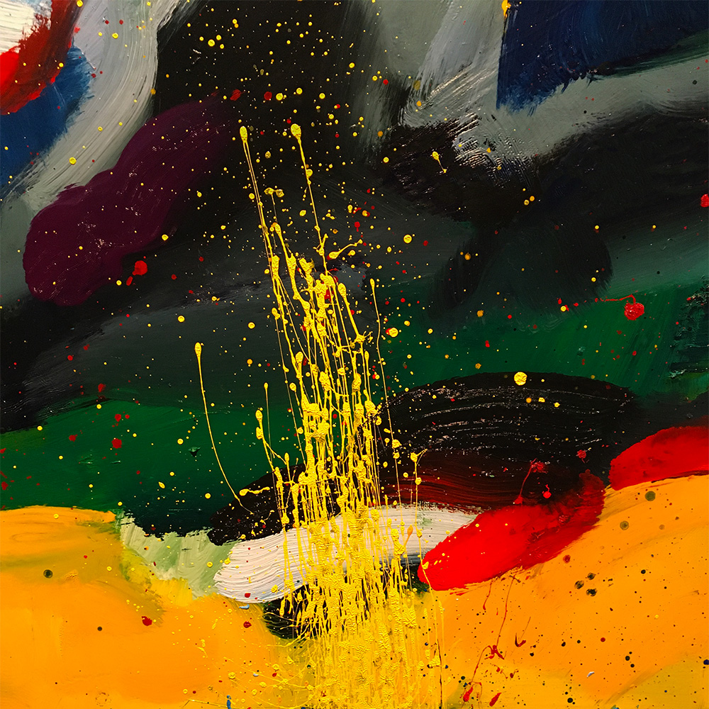
Although my work has always been figurative, when you step much closer to the painting, especially with the bigger ones, al sorts of interesting details pop-up, like little keyholes to another universe.
By early November I organized something I never did before. Because my last gallery went covid-bust and people didn't really go out much anymore, I decided to have an "Open Studio" weekend. More than 93% vaccinated here, that could work. Or not.
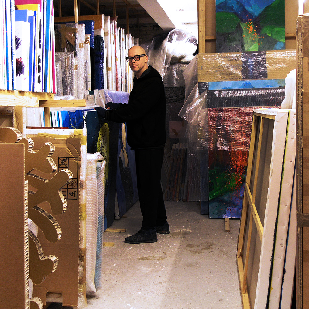
The two afternoons I had my "Open Studio" more than 120 people visited and were so friendly to listen to my explanations. I really enjoyed that. Let’s hope they did too…
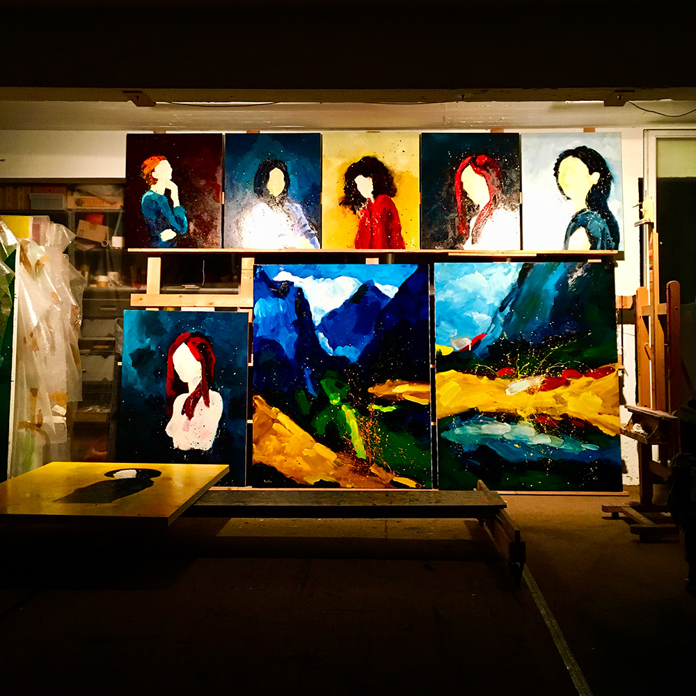
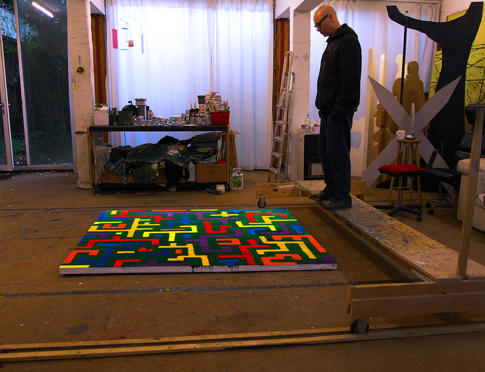
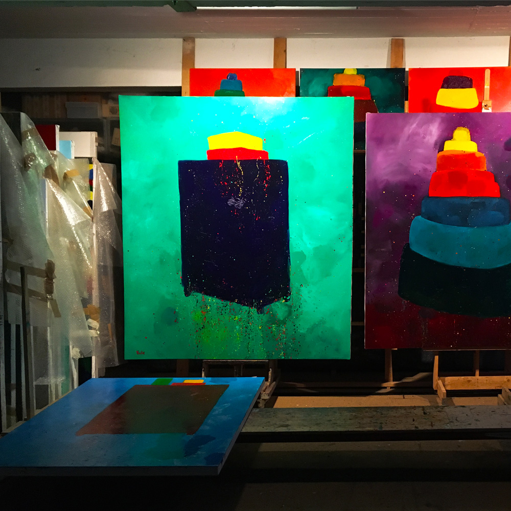
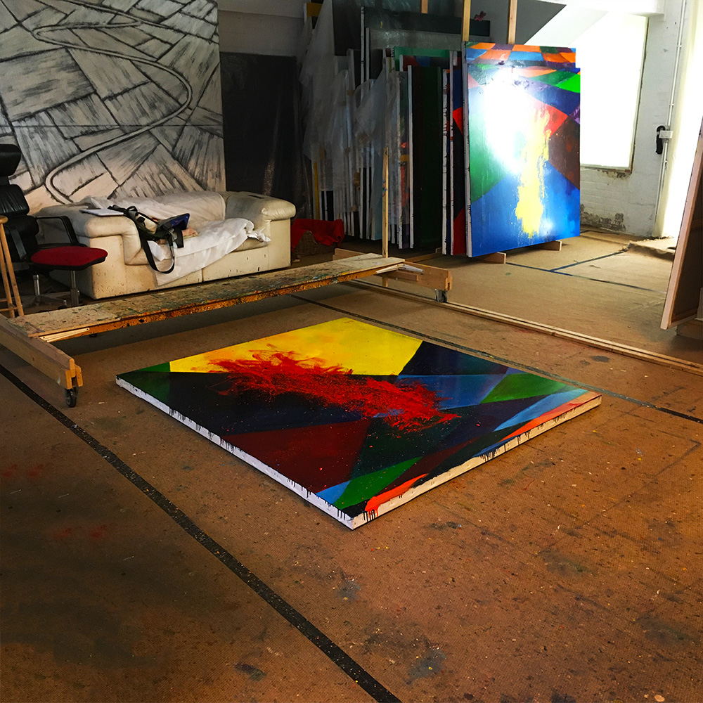
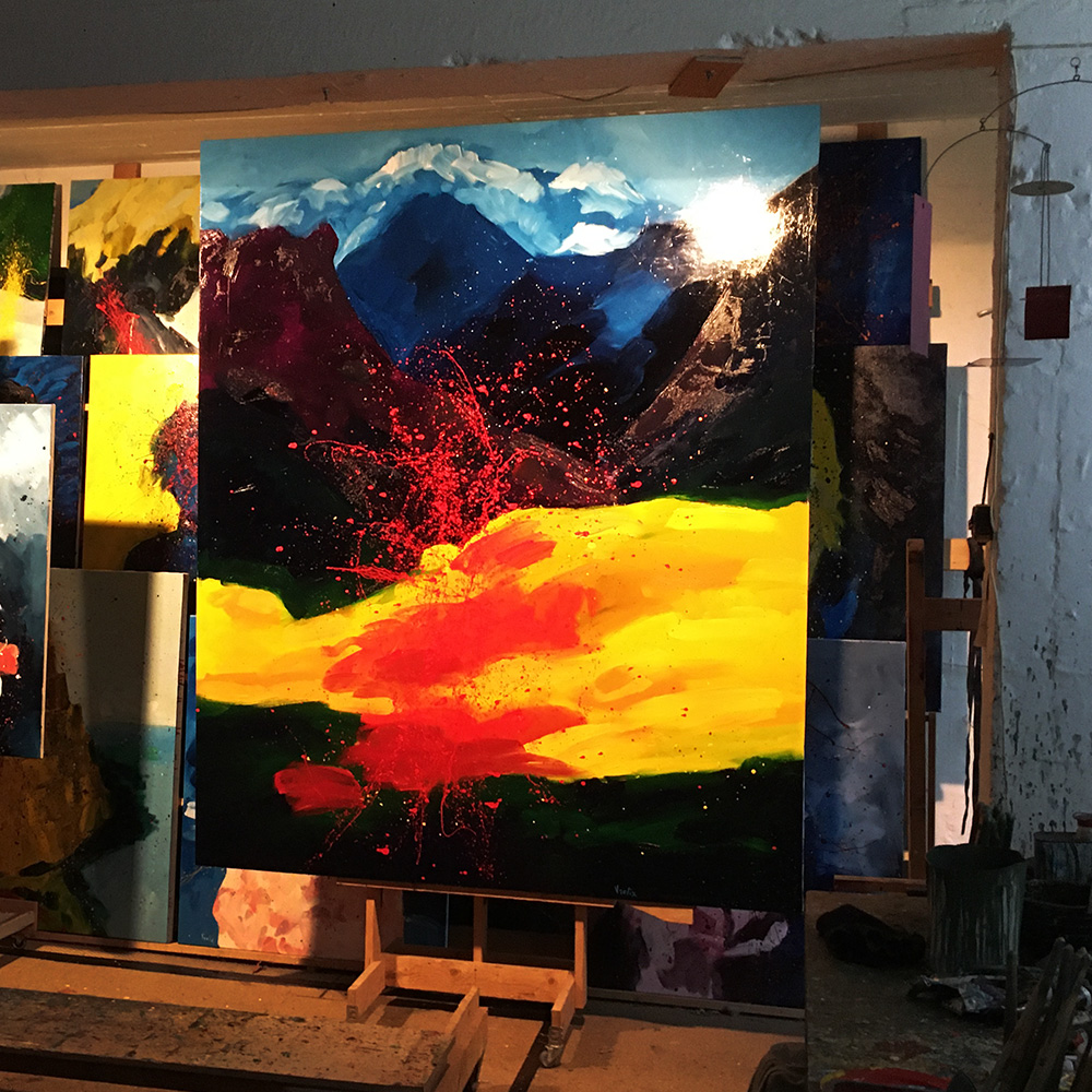
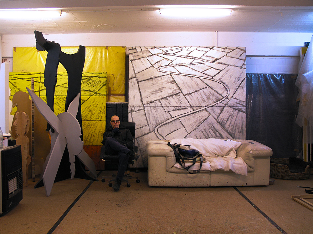
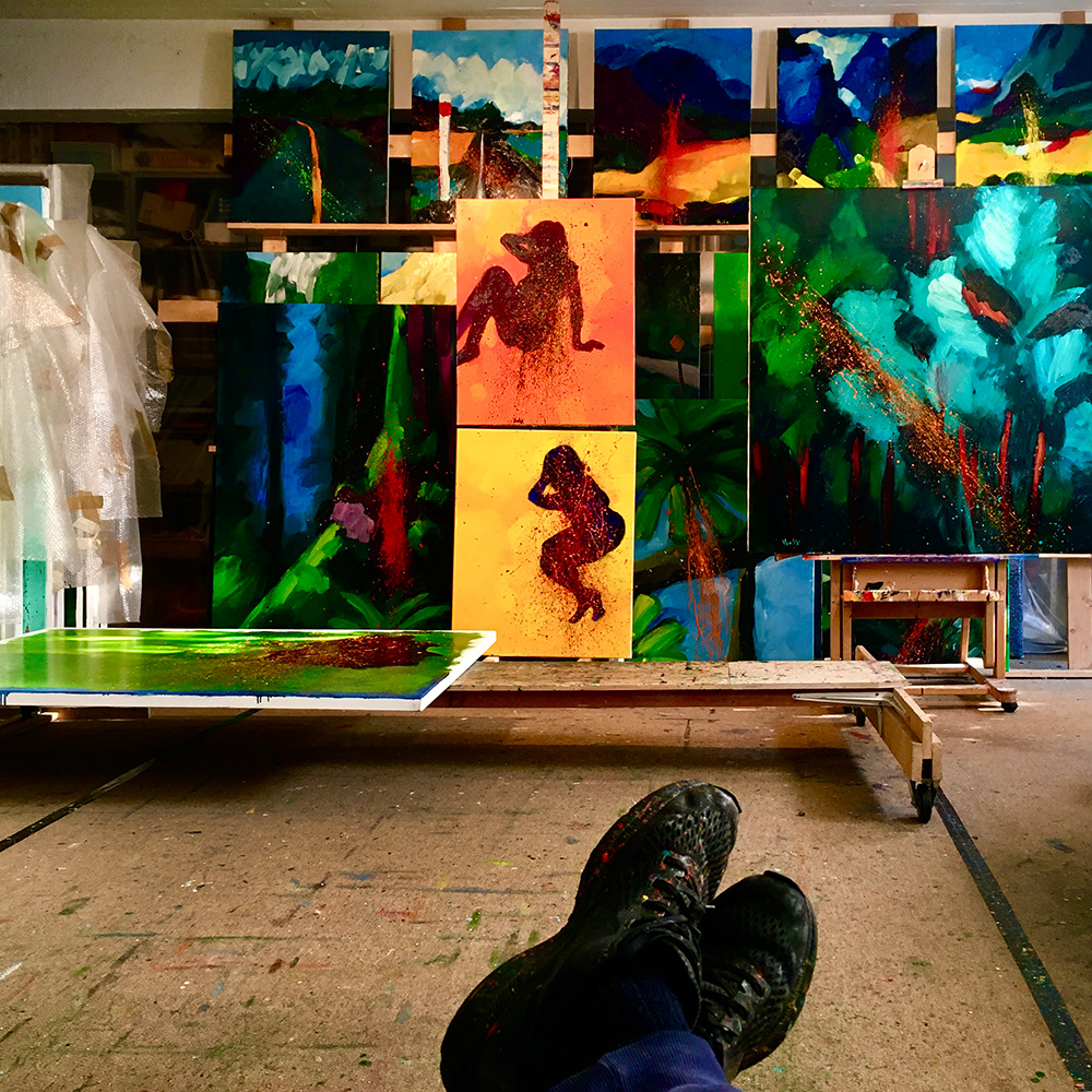
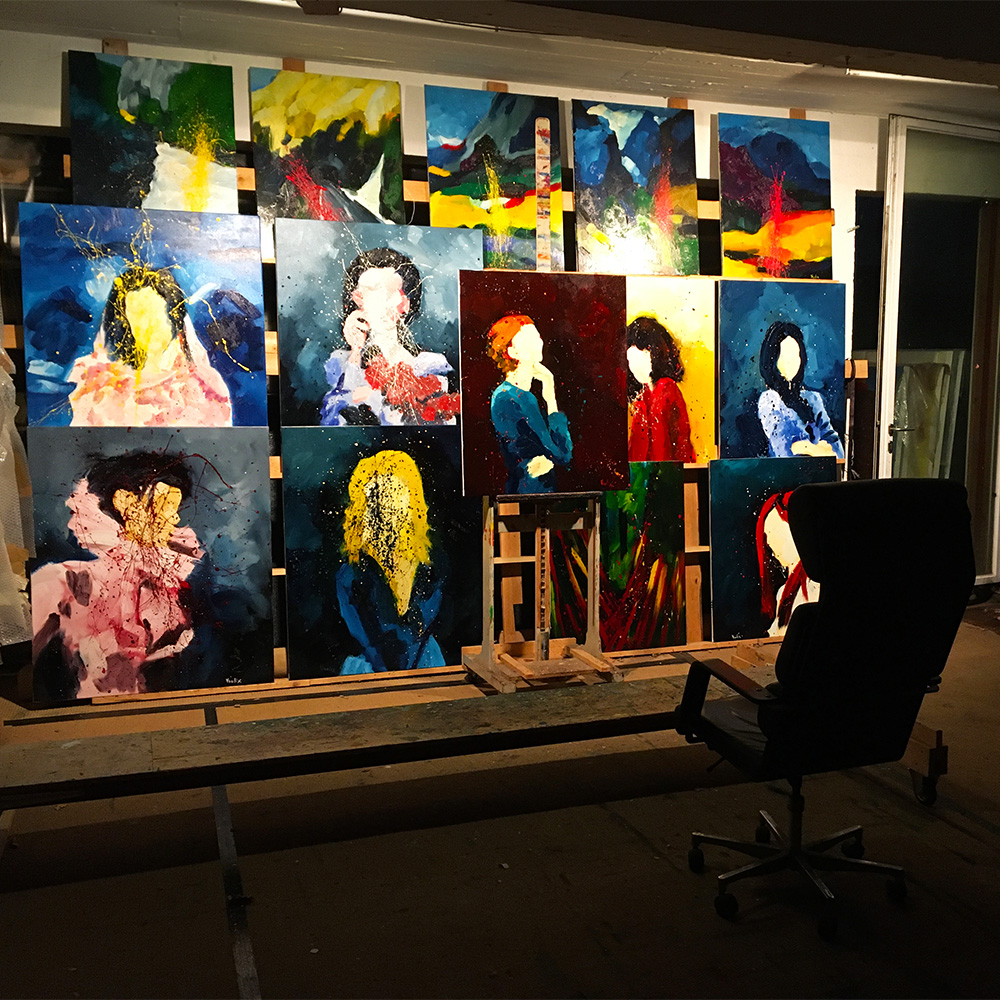
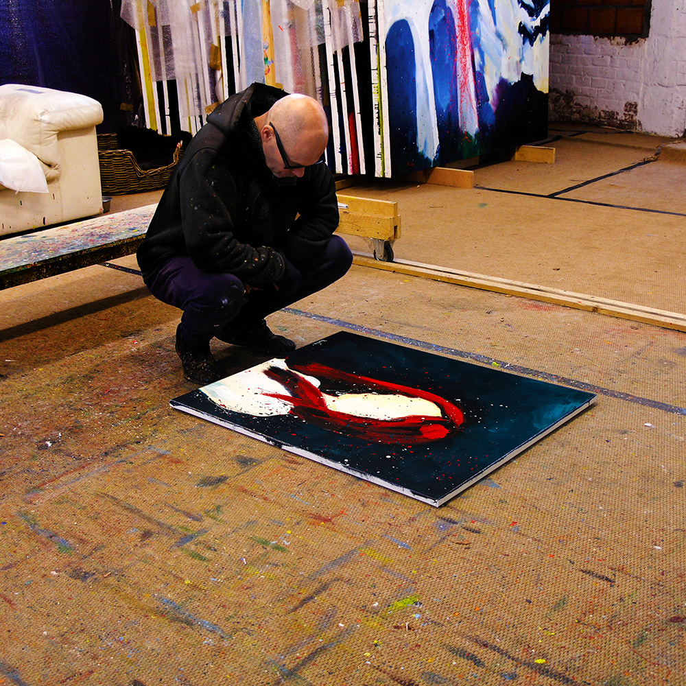
By the end of December I made a little set-up in my studio to see to where I got that year, what it meant but most of all to where it would lead...